The Bureau of Meteorology released its 2022 State of the Environment Report last week, and the headline in newspapers and on radio is that the weather is becoming more extreme. This is also consistent with the message out of COP27 in Egypt where all the world’s leaders gathered just the week before to discuss climate change.
As the theory goes more carbon dioxide equals more heat and more moisture in the atmosphere and so there will be more, and more severe, cyclones. That is what is expected.
Cyclones are of course, the most extreme of all the weather events that we experience.
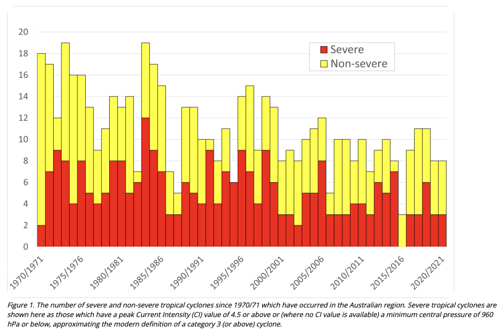
Except. The reality is the number and severity of cyclones is decreasing. That is correct, decreasing. At least since 1971, for the last 50 years. This does not accord with the theory and so the key chart that shows both the number and severity of cyclones to be decreasing (Figure 1) is absent from the key report.
You might think that I am nit-picking – that everything else is as they say. Except that is just not so.
The report explains some of the regional variability in rainfall trends, but tends to the impression that overall, it is getting drier. That has been the mantra from the Bureau for years. Remember the dams were never going to fill again.
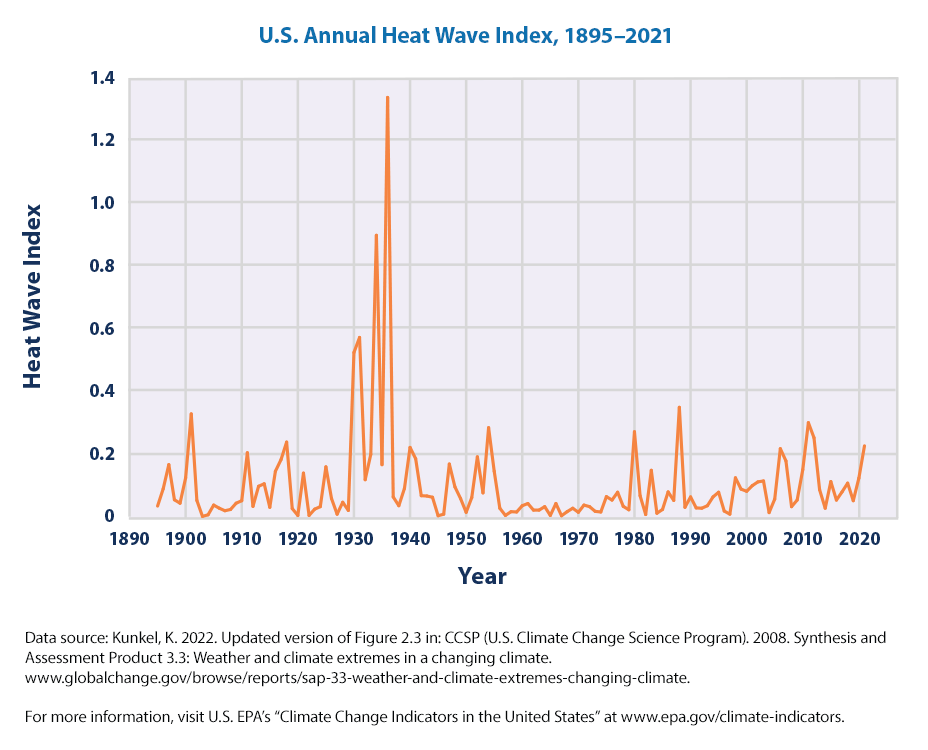
In fact, the second half of the 20th Century was a lot wetter than the first half that included The Federation Drought and the depression years of the 1930s when much of south-eastern Australia became a dust bowl. Then there were the bushfires. My late father grew up near Pyramid Hill and shot rabbits to feed the family back then as a seven year old, he used to tell me what drought and heat and hunger felt like and how to skin a rabbit. The situation in the 1930s in Australia was not that different to the situation in the USA as described in John Steinbeck’s famous novel The Grapes of Wrath. The data showing the heat waves of the 1930s is still available at the US Environment Protection Agency website, click here and see Figure 6.
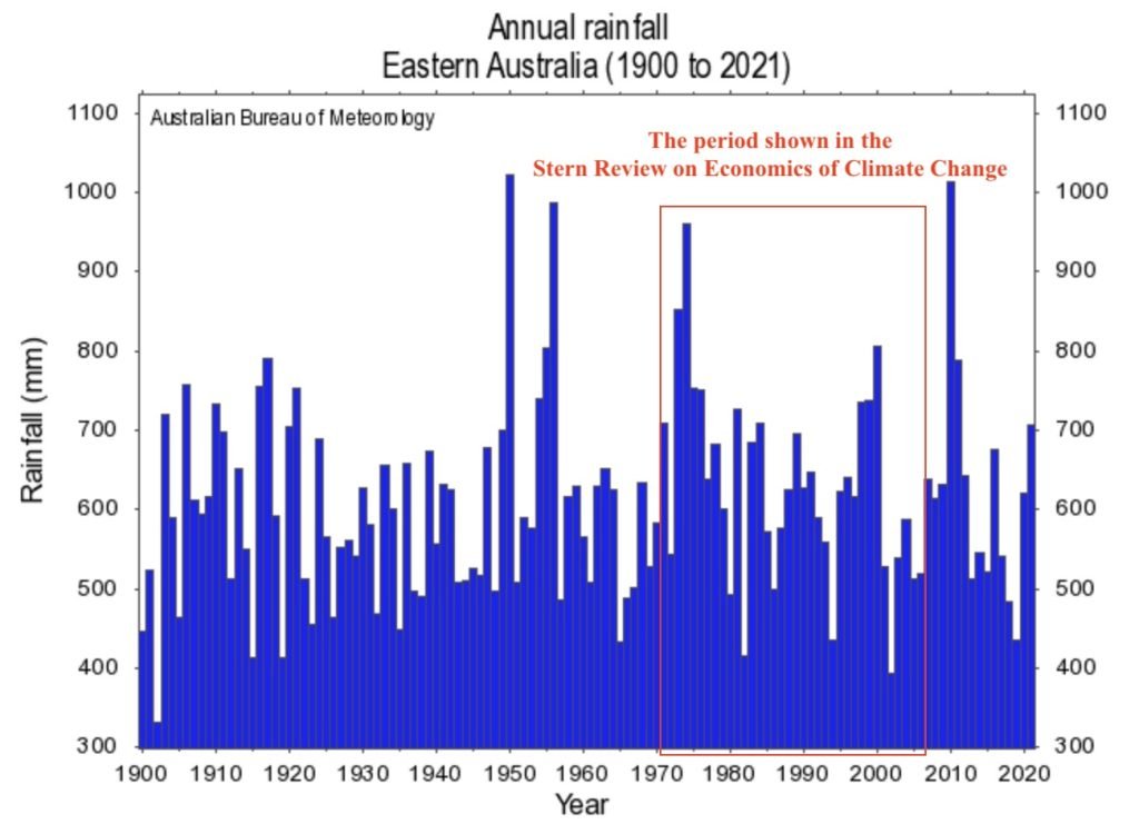
The managers at the BOM like to go on about declining rainfall, however, the overall rainfall trend is only one of decline if you begin in about 1970, which is when the most influential of the early climate change reports began – remember Nicolas Stern’s report: Review on the Economics of Climate Change? I still remember back in June 2006 waking up to journalist Fran Kelly sounding like she was having an orgasm on morning radio as she enthused about Nicolas Stern and his new report that claimed declining rainfall across eastern Australia.
I remember getting out of bed, turning on my computer, and clicking across that morning to the BOM website, finding the relevant chart (see Figure 2b) and sending it across to Fran Kelly’s producer, explaining that there was only decline in rainfall because the Stern Review cherry picked a start date, beginning in 1970 when there was good data available all the way back to 1900.
Of course, since then there has been repeated flooding along the East coast. In fact, 2010 ended up a record wet year, even wetter than 1956 and 1974 that are generally associated with terrible flooding. The totals for all those years could be exceeded this year, when daily rainfall totals are finally tallied. So much for the predictions and advice in Nicolas Stern’s Review on the Economics of Climate Change that caused governments to invest in desalination plants instead of levy banks and reservoirs.
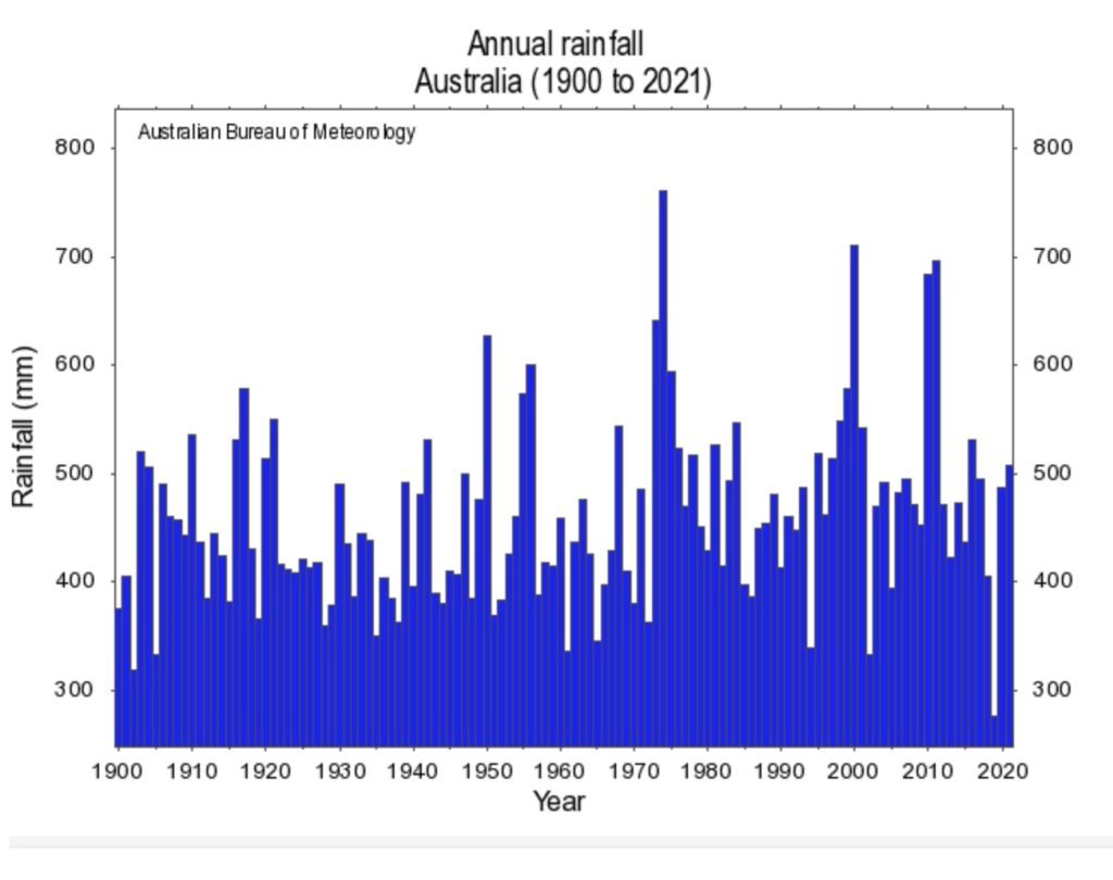
The mantra this last week, never mind the data, has been that there is an overall drying trend in rainfall across Australia, but with more intense downpours. I can’t find the data that supports a greater intensity of rainfall. I made a submission to the NSW flood inquiry after crunching the numbers with Chris Gillham. This data showed that the 1970s were not only the wettest years in terms of total rainfall for Australia, but also had more extreme daily rainfall totals when considering the places that have experienced the worst of the recent flooding. You can read our submission here.
Mention is made in the new 2022 State of the Environment Report of the decline in rainfall in the south-east of Western Australia. That decline appears to be real and not just for the period April to October, see Figure 3 that provides annual totals for different part of Australia. The reason for the local decline may have more to do with the historical clearing of large areas of forest to plant wheat – than atmospheric levels of carbon dioxide.
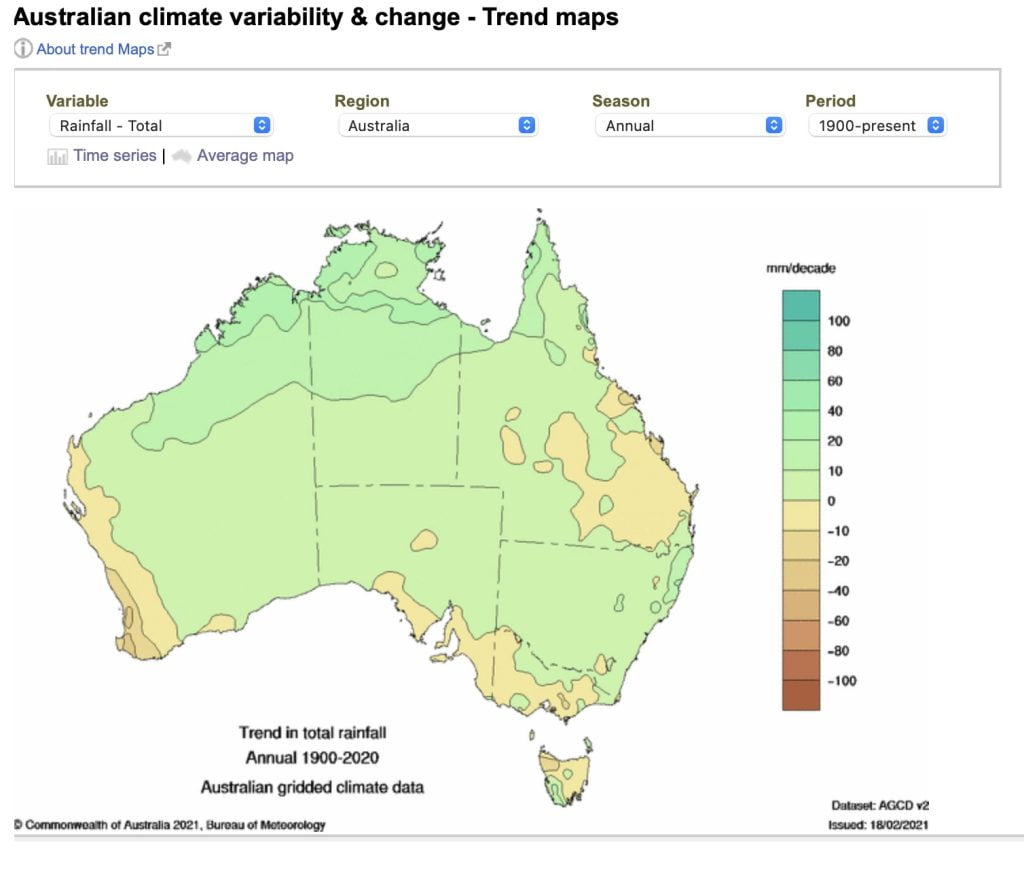
Then there is the issue of temperature, and all the associated who-ha about exceeding the 1.5°C tipping point. It has already been exceeded if we begin in the 1970s – when the deceitful experts, like Sir Nicholas Stern who so excited influential journalists like Fran Kelly, liked to begin the rainfall series.
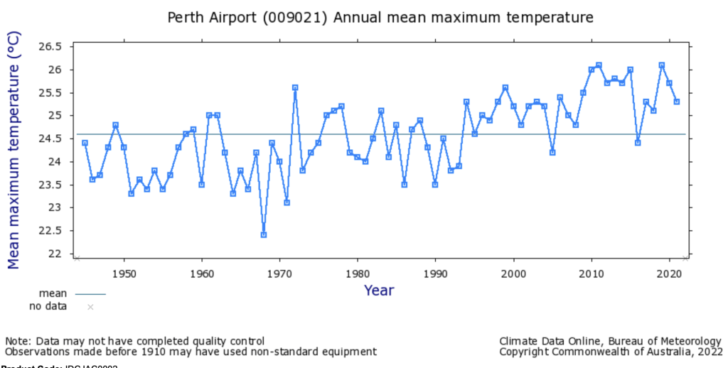
I’ve chosen Perth to show you what some of the temperature increases look like since the 1950s, Figure 4. I’ve chosen Perth simply because I’m heading off there on Tuesday.
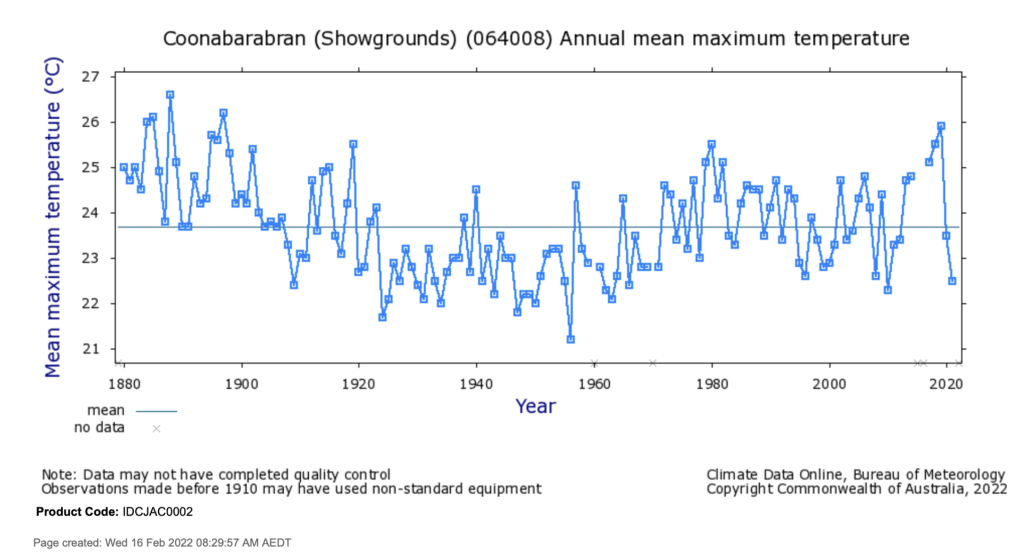
Longer temperature series for many places across the landmass of Australia that begin much earlier, for example Coonabarabran than begins in 1880 (Figure 5), tend to show a cooling trend, followed by warming.
The temperature increase for Perth, for the last few decades, far exceeds the dreaded 1.5°C tipping point. Annual mean maximum temperatures at Perth airport fluctuated around 23.5°C in the 1970s, but more recently temperatures have been a full 2.5°C warmer, at around 26°C, as shown in Figure 4. This may be because of a change in instrumentation, or because of the urban heat island effect.
We don’t know because since the BOM transitioned from using mercury thermometers to electronic probes to measure temperatures, the temperature readings may be up to 0.3°C warmer for the same weather. I’ve shown how this works for the parallel data that I was fortunate to obtain for Mildura when Josh Frydenberg was the Minister responsible for the Bureau.
The only way we can have confidence in the historical temperature record for Australia is if more of the parallel data is made public, that is the data that compares the recordings from mercury thermometers and electronic probes for the same weather stations.
This data was collected from about 38 different weather stations that had electronic probes and mercury thermometers in the same Stevenson screens. For some of these 38 stations, for example Giles in Western Australia, there is parallel data for about 25 years potentially giving a good indication of how electronic probes versus mercury thermometers respond under different conditions.
I will be in court, at the Administrative Appeals Tribunal on 3rd February 2023, as an expert witness trying to get this parallel data released – made public. That court hearing has been five years in the making. During the last two years, with various meetings in an attempt at conciliation, I have been unable to publicly comment or blog on the issue because of restrictions imposed by the court.
I will be writing more about this in the new year. Much thanks to John Abbot for his efforts in progressing the issue, initially through the Freedom of Information process.
Even with the electronic probes generally recording hotter for the same weather, providing temporary spikes because of their shorter response time to changes in temperature, the hottest day in Australia ever recorded at an official weather is still 3rd January 1909 at the Bourke post office with 125°F written down, the equivalent of 51.7°C. This record has been removed from the official database of Australia’s temperatures, scratched by Blair Trewin and David Jones at the BOM.
If we are to be honest to our history, then the record hot day at Bourke of 51.7°C (125°F) must be re-instated, and further the very hot 50.6°C (123°F) recorded for Brewarrina on the same day must be entered into the official database. Also, the temperature of 51.1°C (124°F) recorded at White Cliffs on 12th January 1939 must be recognised as the second hottest ever.
For these temperatures to be denied by the Bureau is a travesty – a terrible lie.
The same Australian journalists that write about the Chinese communist party removing books from Libraries in Hong Kong will not touch this story, they won’t critics the Australian Bureau of Meteorology. They will not investigate how inconvenient temperatures have been scratched from important archives.
If global warming is indeed the greatest moral issue of our time, then every Australian regardless of their politics and their opinion on greenhouse gases and renewable energies, should be honest to this data. There are no excuses.
The issue of scratching hottest days on record and the non-equivalence of recordings from electronic probes may be unique to Australia. The issue of homogenisation, however,occurs at meteorological offices in other countries. Homogenisation is of course where the Bureau cools the past making the present appear hotter for the same weather. You can read about how this is done in so many of the chapter in Climate Change: The Facts 2017. And then there is also my chapter in Climate Change: The Facts 2020.
If you scroll to the very bottom of my blog post ‘Australia’s Broken Temperature Record: Part 2’ you can find an interactive table that shows exactly how the Australian Bureau has cooled the past at the 112 ACORN-SAT weather stations, click here.
The new 2022 State of the Environment Report mentions the number 1.47°C as though this is a definitive statistic accurately representing how much Australia has warmed since 1910. In fact, when the Bureau first published this number, it was for a couple of years ago, and then they published it again at the beginning of this year, claiming it as the extent of warming since 1910 to the present. But, the BOM had in fact omitted to include the data for last year, for 2021. When the data for 2021 is included, the official statistics actually show Australia is already at the dreaded 1.5 °C tipping point, as I explained in a blog post back in March.
But who cares?
If we care about something, we should want to know everything about it.
That is what I say at the end of the film Finding Porites that will screen in Perth, at the Windsor Cinema Nedlands on 1st December. It will actually be a double screening with my new film Bleached Colourful. (Tickets here: https://perthbleachedcolourful.eventbrite.com.au)
In a radio interview promoting the new State of the Environment Report, Australian scientist Jaci Brown makes mention of the dying Great Barrier Reef. Perhaps for good measure. As though, well, if the statistics are somewhat contrived, that the Great Barrier Reef is dying from rising temperatures, that justifies everything – all the obfuscation I mean. Her radio interview was full of it, obfuscation. Jaci Brown presumably knows that the cyclone statistics show neither an increase in the number nor severity of these extreme weather events, so she comments about how they are expected to. One day, apparently, there will be an increase in the number and severity of cyclones.
I have no idea whether Jaci Brown has ever visited the Great Barrier Reef. In the radio interview she mentions being newly returned from Egypt and that the Great Barrier Reef is suffering from climate change. Almost all in the one breathe.
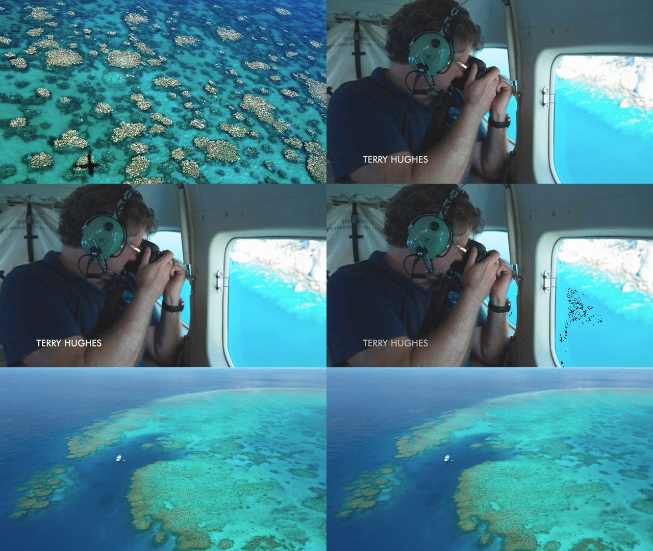
Except, as someone who has been snorkelling the Great Barrier Reef for fifty years, I continue to find it impossible to reconcile the coral wonderland that still exists with claims from aerial surveys – essentially flybys from 150 metres altitude purportedly accurately assessing corals to 5 metres under the water – that conclude 95% of it is bleached.
There is now an official trailer for my new film Bleached Colourful, that includes Terry Hughes in an airplane at 150 metres altitude and also me in Scuba under-the-water at John Brewer Reef. Watch the official trailer here.
******
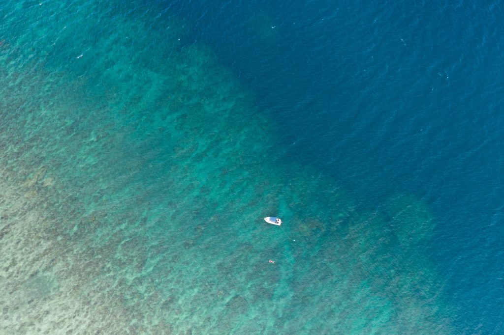
The feature image (top banner of this blog post) shows me floating above Pixie Reef. This is what you can see from a drone at 5 metres altitude with the corals 2-3 metres under the water.

To see the corals at this spot from under-the-water, scroll down to the table (Table 3.1) that shows the transects from the reef front here: https://jennifermarohasy.com/coralreefs/pixie2021/
That includes this coral that I’ve written a story about (so far unpublished) entitled Who ate the Green Plate. 

 Jennifer Marohasy BSc PhD is a critical thinker with expertise in the scientific method.

Is there an Oz “standard for Stevenson screens. There appears to NOT be a “standard for their “location”. So, will any old wooden box painted white do the job? I suspect there is more “creativity” afoot on the “instrumentation” front.
After all, “political” science is where the really big bucks are to be found.
Jennifer you are a saint (in spite of your declared atheism) in my book. I come close to despair in a world where the vast majority of elites believe that truth is no longer important and that any lie is justified in pursuit of their ideology. Thank you.
What models are the BoM etc using for the supposed warming?
Why are they not published anywhere?
How do we fund a New World Order where corporations drive out small business?
Carbon taxes …. very retrogressive if we exclude aircraft from this ‘pollution’.
Scientific ignorance can be costly ….
Daily maximum temperatures are not an appropriate measure of warming (or cooling). Assessment of system energy needs continuous monitoring of temperature and humidity at the very least. This has been possible for at least the last 50 years, possibly longer, though that is not sufficiently long to really understand if climate is changing. I am far more concerned about sustainability than a so called climate emergency.
Mistrust in the BOM is unavoidable these days. At Inverloch Victoria, we don’t have an official BOM measuring station as it is located 7km away at Pound Creek. Strangely, here in Inverloch we have measured in both electronic and standard rain gauges, nearly 200mm difference YTD. It is hard to believe.
The only reason the BOM and the supporters of COP 27 support this doom and gloom is they have lots invested in renewable energy and if they were right then having such bad climate myths makes there renewables useless
The current Minor Dry Cycle started at 170 deg E (South Island of New Zealand,) circa May 1, 2022. It will last over Australia until mid-January 2023. It has been ameliorated primarily, by volcanic activity in the Southern Hemisphere regions of Indonesia, which produced the recent North-West Cloud-bands that have been manifest in the flooding in South-East NSW and VIC. ( Axial Spin.)
The next Regional Dry Cycle will affect Australia from January 2026 until mid-May 2026.
So we are in for three years of Wet/Normal and Cold, with the ‘elephant in the room’ being continued volcanic activity, especially (in Australia’s case ) from Indonesia.
The next Minor Dry Cycle will start Over 140 deg E (Central Australia) In November 2026,
( as the Cycle advances from East to West, it will not affect Eastern Australia.)
The Start Longitudes of these Dry Cycle Hierarchies will now occur to the West of Australia, thus, the Minor Cycles will not reach Australia at all, until January 2048.
The next two Regional Cycles will reach Australia from August 2032 ~ February 2033 –
and from October 2045 ~ mid-June 2046.
The path of these Dry Cycles results in an increase in temperature beneath their ‘footprint’, as they orbit the planet.
As these Dry Cycles only repeat every 81 Years – and there is the fluctuations in volcanic activity to consider, there are NO valid Temperature or Precipitation data sets currently produced by Bureaus of Meteorology anywhere on the planet.
The South Island of New Zealand is now in Drought.
How it works;
https://drive.google.com/file/d/1TFFDXyhe5b0ZfLCiFt23W4PbubQaQfQo/view?usp=sharing
Yeah… on the subject of lucrative misinformation, our paid bushfire hierarchy set up university departments funding academics for the oxymoron that apocalyptic fuel loads do not cause apocalyptic fires. The media scattergunned this misinformation. Scarily, a vast swathe of university educated teals believe this, I suppose because universities teach climate dogma in a multitude of disciplines – evan law. I expect anyone at university who points to fact risks being filtered out, possibly in a most unpleasant way, making climate dogma important for academic survival. Take for instance the recent bastardisation of Professor Ridd for pointing out that he can’t find vast tracts of dead reef. Likewise, during my PhD studies I was progressivley vilified for my bushfire findings that firestorms became serious problem in the 1920s when government began to take over bushfire management and prosecute people who reduced fuel loads. Large cash injections follow bad fires so bushfire infrastructure grew – allegedly in order to improve firefighting. Increasingly infrastructure began to depend on misinformation for funding. That it is misinformation is so self evident… turn on a gas BBQ. Cooking temperature has nothing to do with the weather – if there is no fuel there is no flame. If you turn down the gas the flame is less. Fuel feeding the flame determines fire intensity. Whether or not it is a hot day has nothing to do with cooking snags. Likewise, most firestorms begin on mild days as small, easily extinguished fires. As the fires burn, they increase in intensity as they increasingly change conditions making it hotter, drier and windier. If fuel loads are high, eventually the fire builds to an unstoppable firestorm where decade after decade, squadrons of aircraft and fire trucks prove almost useless – WWII science that aided Allied victory with fire bombs – it is impossible to put out a firestorm. fighting a firestorm is extremely costly and ineffectual but good for paid bushfire infrastrucure funding. But BoM has just claimed we are locked in to worsening firestorms!!! The real cause of firestorms? 1. Fuel loads of 7.5 tonnes per hectare or more – ie bush that is too thick to walk through comfortably ie most national parks in southern regions. 2. Attacking potentially dangerous fires too late, once they have built to unstoppable intensity. 3. Monetary injections after bad fires that fund infrastructure dependent on the firestorm business model.
>”I will be writing more about this [AAT February 2023] in the new year.” (Jennifer M above)
Yes please. I regard it as interesting that there is well-funded, organised resistance to releasing actual data. We would like to know exactly who is resisting and who is funding them.
So now the UN/UNESC has finally come out and advises the Australian government both State and Federal, that after their visit in March this year in order to monitor the Great Barrier Reef, Australia must implement more stringent measures to reduce (carbon) emmissions.
So what exactly did these Unesco people do here? I don’t know. But I do believe the reports from Jennifer and her colleagues on this site and I feel sure that her conclusions are accurate and fair. There is no risk to the reef from ’emmissions’.
For the UN it’s all about emmissions, and control. And that is political control over the people of Australia which I find abhorrent. We should reject it outright.
I noticed the BoM presenting temperature average graphs compiled by the Australia Institute. Doesn’t the BoM have their own temperature data?
I also note the Australia Institute appears to be an AGW ‘think-tank’.
Surprise,surprise….