Anyone who doesn’t take truth seriously in small matters cannot be trusted in large ones either. Albert Einstein.
THE Australian Bureau of Meteorology extrapolates from the particular to the general in the development of their annual climate statements, but with a complete lack of fidelity to the original recorded temperature values at many locations. Indeed scrutiny of their methodology shows that the annual average temperature for Australia is a totally contrived value achieved through the rewriting of history at iconic locations including Bourke in north western New South Wales.
The Bureau’s claim that last year, 2013, was the hottest on record is based on the compilation of data from over 100 individual weather stations, including the station of Bourke, but only back to 1910 and with this data significantly truncated and adjusted.
Bourke has an exceptionally long temperature record, with recordings made at the post office from 1871 until 1996. Then the weather station was moved to the airport.
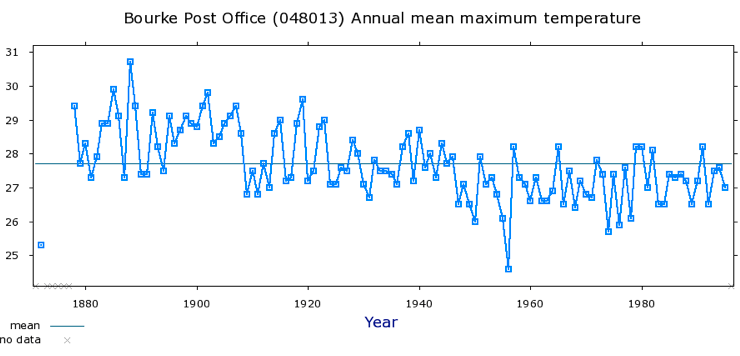
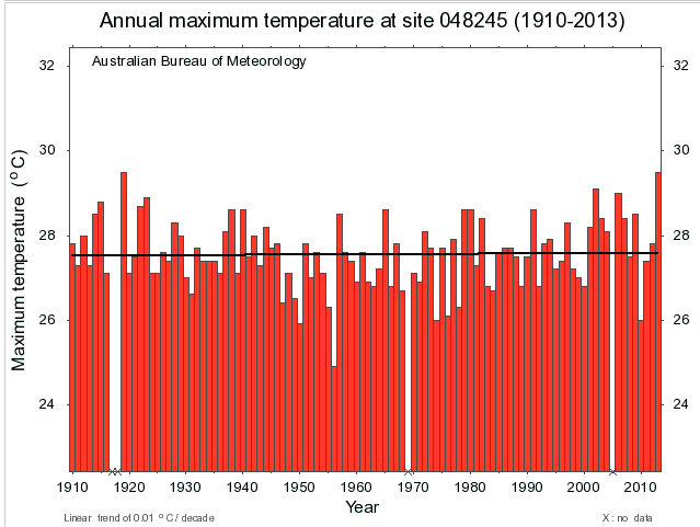
In part 1 of this series, I explain how individual hot days recorded by the Bourke postmaster have been expunged from the official temperature record and how the data series is significantly truncated. Now let’s consider how adjustments are made to the remaining mean maximum temperature series so that a cooling trend, Chart 1, becomes a warming trend, Chart 2.
Chart 1. Mean annual maximum temperature for Bourke post office (1871 to 1996) based on unadjusted digitised data, minus the record hot days. Click on the chart for a larger better view. Find more information and a link to this chart at the Bureau’s website by clicking here.
Chart 2. The official mean annual maximum ACORN-SAT temperature data for Bourke including more recent temperature data recorded at the airport, but excluding data collected at the post office before 1910. There is more information, and a link to this chart at the Bureau’s website here.
The change from a cooling trend to a warming trend of 0.01 degree Celsius per decade is achieve in part through the following three modification to the original data:
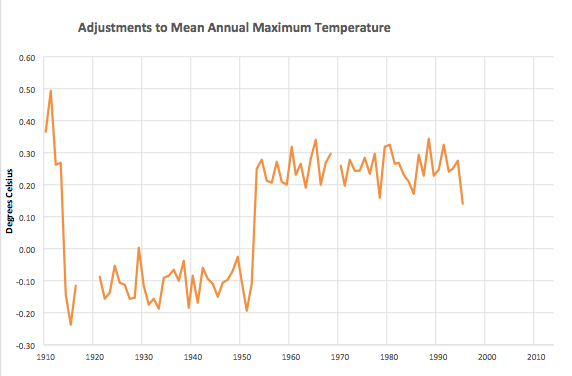
1. Two dramatic adjustments to the original temperatures record: an adjustment down between 1911 and 1915 and an adjustment up between 1951 and 1953.
Chart 3. Difference between annual mean maximum temperature for ACORN-SAT series minus the original digitised data for Bourke post office 1910-1996. Data compiled and chart drawn by Ken Stewart.
It is reasonable to adjust temperature data to correct for discontinuities caused by changes in site location and exposure. But from August 1908 through until 1996 the Bourke post office did not move and the temperature thermometers continued to be housed in a first class Stevenson screen. It is also reasonable to consider changes in observation time, and changes to metric measurements, even the introduction of automatic weather stations. But none of these potential reasons for adjusting a temperature data series can be used to explain the dramatic adjustments between 1911 and 1915 and 1951 to 1953 to the Bourke post office temperature data, Chart 3.
Rather a perfectly good data series appears to have been butchered to achieve a particular political end.
2. Substituting values recorded at the Bourke Post Office with values from other weather stations.
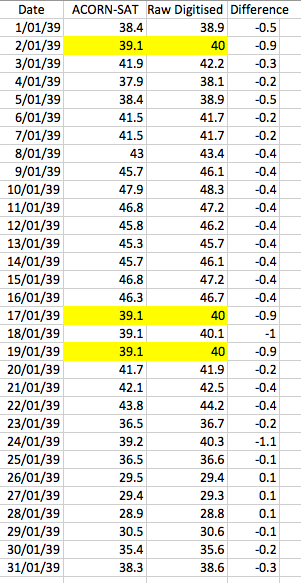
Table 1. Recorded maximum daily temperatures at Bourke versus ACORN-SAT maximum daily temperatures at Bourke for January 1939
In a report entitled ‘Techniques involved in developing the Australian Climate Observation Reference Network – Surface Air Temperature (ACORN-SAT) dataset’ (CAWCR Technical Report No. 049), Blair Trewin explains that up to 40 neighbouring weather stations can be used for detecting inhomogeneities and up to 10 can be used for adjustments. What this means is that temperatures, ever so diligently recorded in the olden days at Bourke by the postmaster, can be change on the basis that it wasn’t so hot at a nearby station that may in fact be many hundreds of kilometres away, even in a different climate zone.
Consider the recorded versus adjusted values for January 1939, Table 1. The recorded values have been changed. And every time the postmaster recorded 40 degrees, Dr Trewin has seen fit to change this value to 39.1 degree Celsius. Why?
In the original data the number of consecutive hot days over 40 degree Celsius is 17, Table 1. In January 1896 there were 22 consecutive days over 40 degrees Celsius. But neither of these two series of hot days exist in the current official Bureau record for Bourke because of the all truncating and adjusting.
Ian George, a regular contributor at this blog, has done a comparison of temperatures at Bourke with temperatures at the ‘nearby’ stations of Cobar, Tibooburra and Walgett to see how ‘nearby’ stations could influence Bourke’s temperature for January 1939. These are all ACORN-SAT stations. Ian George noted that after looking at the long-term average maxima for January, Bourke has the highest at 36.3 degree C. After checking the original temperature maxima Bourke had the highest for January 1939 at 40.4 degree C. After then checking the ACORN-SAT temperature for the same period, however, Bourke dropped to fourth place. Why?
3. Truncating the data by discarding the full 39 years of data from 1871 to 1910.
The postmaster at Bourke started recording temperatures on 25th April 1871, but the first 39 years of data is discarded on the basis the thermometers were not housed in a standard Stevenson screen. The early thermometers may have been housed in a non-standard Stevenson screen or at worst at Glaisher stand that can record temperatures up to 1 degree Celsius warmer in summer and 0.2 degree Celsius warmer in winter.
There are many peer-reviewed publications that show how to adjust temperature data based on the shelter used to house the thermometers.
A standard Stevenson screen was installed at Bourke in August 1908. Rather than adjusting the data before this month in the development of the ACORN-SAT official data series the Bureau has chosen to discard the earlier full 39 years of data. And then proceeds to adjust the data after the installation of the Stevenson screen.
To read more on this topic…
Part 1, Hot days
Part 3, Shortening an already shortened record
******
This blog post draws on comments in earlier threads from Ian George and Bob Fernley-Jones and email correspondence with Lance Pidgeon and Ken Stewart.
In future posts in this series I intend to show how adjustments have been made to the minima and how the official adjusted data is incorporated into global temperature databases.

 Jennifer Marohasy BSc PhD is a critical thinker with expertise in the scientific method.

Hi Jen,
In late May early June , ( 2011 from memory), I was working inland toward Wanaaring from the Darling river. One cold foggy morning the ABC Dubbo announcer stated that, once again, there were no readings from Bourke and a couple of other locations, because recently there had not been enough sunlight to charge the batteries at the automatic stations .
Do these stations still record in these circumstances , or do the cold days disappear ?
( And get ‘ computer modeled’ instead )
Interesting, Ian.
There’s a famous Latin inscription for a sun dial, which, roughly translated, means “I don’t count the hours which aren’t fine and sunny”.
A motto for our BoM?
The deathtoll during the heatwave of 1896 really hit Bourke hard. During the massive widespread heat of January 1896 as published alongside the daily heat apoplexy death tolls in many newspapers is the report of a localised severe frost and fog from Yass N.S.W.
http://trove.nla.gov.au/ndp/del/article/72373894?zoomLevel=6
Many people around the area but not right there could not believe that it happened and wrote in to nearby local papers with sceptical theories. Here is one theory from the Goulburn evening penny post.
http://trove.nla.gov.au/ndp/del/article/98562075?zoomLevel=6
I think this Goulburn theory does not explain the fog. So it is more likely that the fog did not happen. This is my theory. The Frost did happen but what people saw and described as fog was the frost dissapearing in a puff of Acorn homogenisation.
Morning Jen
Well done Jen, an excellent summary of the problem. Good luck with minima, I’m having terrible trouble making any sense of the adjustments at all. Surely they couldn’t have included Brewarrinna Hospital in their 40 or 10 neighbours as its record is rubbish. And as you say that 40th neighbour with decently correlated overlapping observations is going to be hundreds of kilometres away.
Bourke PO, Airport, and AWS should not be combined into one composite record, as there is insufficient overlap and all three have very dubious observations e.g. the AWS recorded in whole degrees every day from 15/12/1998 to 27/08/2002 (so the temperature recorded was +/- 0.5 C), and with large numbers of missing days after that. There are numerous inconsistencies in the PO data too of course. But the adjustments have not improved the record at all, in fact it’s garbled.
Jennifer your Einstein quote says it all!
US Senate Committee in Environment &Public Works 12/06/06 Statement
of Dr David Deming.
‘ I received an astonishing email from a major researcher in the area of
climate change. He said, “We have to get rid of the Medieval Warming Period.”
http://www.epw.senate.gov/hearing_statements.cfm?id=266543
Say, why does Chart 3 remind me of that email and Mann’s Hockey Stick?
Bom usually says their records only go back to1904 but when it suits they say things like Hobart had the hottest days for 134 years or something a week back.
Not only those days of 40+ degrees……….
18/1/39…….40.1 becomes 39.1
24/1/39…….40.3 becomes 39.2
Basically it seems that 1939 is Burke’s “medieval warm period” and must be as Beth says, got rid of.
Please note, I used January 1939 as an example. I could have any number of others. But sometimes less is more. 🙂
The 2 adjustments, down from 1911-1915 and up from 1951-1953 sum up the data foundation to AGW. Is there any attempt to justify this?
What I find interesting is that after all the justification for why these ACORN stations have to be homogenised (i.e. to better reflect the overall temperature because the ‘raw temps’ weren’t trustworthy enough), the ACORN temp data for 2013 at Bourke appears to be the same as the raw data.
If recent raw data is now credible enough to be reflected in the ACORN data without comparing it to nearby sites and therefore homogenised, it raises some questions.
Why was the data adjusted and truncated prior to 1950? Why isn’t the data being so now?
And why, after 12 months of ACORN, did we suddenly have the hottest day, month, season and year in 2013 (yet RSS doesn’t show any significant warming)?
Thanks, Jennifer.
Jen.
I am not sure this is the clearest wording. It had me confused for a while.
“The early thermometers may have been housed in a non-standard Stevenson screen or at worst at Glaisher stand that can record temperatures up to 1 degree Celsius warmer in summer and 0.2 degree Celsius warmer in winter.”
Bearing in mind that this post thread is about what maximums do it would be more correct to say over 1 degree warmer on a sunny very hot day and not much different on a cool cloudy day. The main problem Glaisher stands had was sun exposure.
Minimum temperatures can be lower than that recorded in a Stevenson screen.
Beth cooper and redress
A more relevant email concerning the 1939 Bourke downward adjustments is this one from Tom Wigley to Phil Jones. Some quotes from it below. More detail at the links.
“the land also shows the 1940s blip (as I’m sure you know). So, if we could reduce the ocean blip by, say, 0.15 degC, then this would be significant for the global mean”
“then with a reduced ocean blip we get continuous warming in the SH, and a cooling in the NH — just as one would expect with mainly NH aerosols.”
“It would be good to remove at least part of the 1940s blip, but we are still left with “why the blip”.”
http://stevengoddard.wordpress.com/2014/04/02/getting-rid-of-the-1940s-blip/
Text of email.
http://hidethedecline.eu/pages/posts/analysis-of-the-central-netherland-temperatures-260.php
It may be pure coincidence that the Acorn blip inPhiling gives them more Wigley room.
The Bolter lists some of the ways the latest IPCC report has been doctored. This just proves that the extremists are losing the argument.
http://blogs.news.com.au/heraldsun/andrewbolt/index.php/heraldsun/comments/how_the_ipcc_report_was_doctored_to_scare_you/
http://stevengoddard.wordpress.com/2014/04/02/getting-rid-of-the-1940s-blip/
Yes, Siliggy, no blips in the record or holes in the bucket allowed dear Eliza.
Jen,
FYI
http://stevengoddard.wordpress.com/2014/04/08/summer-temperatures-plummeting-in-new-south-wales/
Beth Cooper
“Yes, Siliggy, no blips in the record or holes in the bucket allowed dear Eliza.”
Beth a good way to get rid of blips all together is to replace the fine signals in the data with an all erasing straight trend line.
I prefer to see the curves in trendlines. This near sine wave shown on this line in the Bourke raw max data gives clues a straight line does not show but also erases the 30s/40s blip.
http://www.waclimate.net/imgs/bourke-max-chart.gif
See the different frequency shown in the curve of the bourke raw min data.
http://www.waclimate.net/imgs/bourke-min-chart.gif
From these it can be seen that both show a long term warming in Bourke since 1871 but the max temp warming was most extreme before 1910 (and therefore not caused by CO2). The rise in min temps shows no hockey stick.
Most interesting is that while the long term average temperature (1/2 min + Max) seems to have gone up, the range of the thermometer is going down. This range change occurs in a way that defies a relationship with CO2 also. A straight line trend from 1910 would show something else.
This global straight line gives the false impression that our childrens children may become superconductive.
http://www.woodfortrees.org/graph/uah/from:2009.2/plot/uah/from:2009.2/trend
Lance Pidgeon
Charts thanks to Chris Gillham and Woodfortrees.
Siliggy
‘From these it can be seen that both show a long term warming in Bourke since 1871 but the max temp warming was most extreme before 1910’.
I’ve been looking at the BoM’s ‘Climate statistics for Australian locations’ and found a cooling trend for Bourke over the past 100 years rather than a warming trend.
According to the BoM’s data, the max mean for Bourke from 1911-1940 was 27.8C.
The max mean for Bourke from 1971-2000 was 27.1C, some 0.7C cooler (these are from the Bourke PO which closed in Aug 1996).
If you look at the 30 years from 1983-2012, the average max is around 27.4C. This takes in the PO, the Airport (opened Nov 94, closed Jan 99) and the AP AWS (opened in Dec 98).
There is one overlapping year between the PO and the AP in 1995 where the AP is 0.2C warmer.
I started my search at 1911 as the SS was used from around 1908. If you look at the years 1880-1910 the max mean was 28.6C.
Source
http://www.bom.gov.au/climate/averages/tables/cw_048013.shtml
I believe this site uses the raw data only, not homogenised as was the HQ data sets produced before ACORN.
Ian George
I dislike needing to take what could be mistaken for the warmist point of view. It makes me feel sick and sad but…
“Anyone who doesn’t take truth seriously in small matters cannot be trusted in large ones either.”
Time to Play Gomer Pile.
I have data from the 1896 screens at Adelaide. The comparison between Stevenson and Glaisher gets interesting. As i said above. “it would be more correct to say over 1 degree warmer on a sunny very hot day” The average difference between the Glaisher reading max and the Stevenson Screen max at Adelaide for March 1896 was more than 1.7 full degrees C. A daily February difference was 4.1 degrees F. I feel these differences were perverted by poor Stevenson location as it was near perhaps in the morning shade from the Octagon House.
It is NEVER safe to assume that the BoM have gone about things the right way. It is also not wise to use their methods. They seem to have this daft idea that converting from Glaisher to Stevenson is as simple as subtracting an averaged monthly correction figure from the Glaisher. This is as bad as Acorn. It should not be done this way. It needs to be done on a daily basis and where possible be modified by wind speed and cloudiness. Fortunately as well as an “in the shade” measurement the smarter old guys recorded an “In the sun” temperature that can help with this. So a Bourke site specific and daily conversion needs to be done for comparison. Bourke can be a very sunny place.
Have a look at this page. Select “Mean or less” from the drop down menu and look at the 1870s colour.
http://www.bom.gov.au/jsp/ncc/cdio/weatherData/av?p_nccObsCode=36&p_display_type=dataFile&p_stn_num=048013
I would like to see the BoM mark the Glaisher data by Colour on old records and show all the old records for the length of the overland telegraph etc. They also need to be consistant with this. Like showing the old data for Adelaide as they do for Sydney and Melbourne but we need to know the stand type.
If they are audited by the ABS i hope they start with a good look at old methods.
I suggested elsewhere that the best way to look at the temperature record is to do a moving linear regression over 365 days for each site and find the averages of this rate of temperature change . The Broken Hill data shows why this is a good idea. Any sudden changes will show up as outliers and can be removed (anything well outside 3SD will only remove a third of a percent of data). The change in number of sites and placement should not have an effect if it truly is a measure of global temperature change, and this can be checked.
Siliggy
I’m sorry. I wasn’t questioning your point of view.
I was just pointing out that the data from the the site you mention in your most recent post above (BoM) gives a cooling trend from 1910-1996 rather than the warming trend in the waclimate series.
If I check Carnarvon on the waclimate site, the annual means do not reflect the BoM’s raw data on Carnarvon. In fact, some of the 60s annual temps are quite warmer than the raw data.
There appears to be a different data set being used for Carnarvon on the waclimate site – is it the same for Bourke?
Here’s the raw data graph for Bourke PO from the BoM.
http://www.bom.gov.au/jsp/ncc/cdio/weatherData/av?p_display_type=dataGraph&p_stn_num=048013&p_nccObsCode=36&p_month=13
I agree with you – don’t assume the BoM have gone about things the right way. I’ve been a critic of the BoM’s adjustments from raw to HQ data to ACORN.
Sorry if I’ve offended.
Have I not been paying attention? I’ve just found that there were TWO DIFFERENT Bourke Airport sites and a few other funnies including some changes at the PO, according to this:
http://www.bom.gov.au/climate/change/acorn-sat/documents/ACORN-SAT-Station-Catalogue-2012-WEB.pdf
Bourke (048245/048239/048013):
The current site (048245) is an automatic weather station on the north side of
Bourke Airport, 6 km north-northeast of the town centre. The screen is over
natural grass with some low bushes in the vicinity.
History
Observations were originally made within the Bourke township (048013).
This site had trees and buildings nearby and the lawn around the screen was
regularly watered. There was a small site move within the Post Office yard in
May 1937, and the screen was replaced in November 1964.
A site (048239) was established on the southern side of the airport near the
terminal building on 11 November 1994. Observations continued there until
January 1999.
The current site began operations in December 1998, 700 m north of the
previous airport location but with only a minimal overlap. These data are
used in ACORN-SAT from 1 January 1999.
A photo of the latest site is included at the link
Bob,
Thanks for the info re Bourke PO w/s and the graphs you sent to me via Jennifer.
Gen obs re the 3 w/s.
The combination of trees, buildings and watering at the PO may have affected the overall temps as these days an AWS does not have any buildings, trees, etc nearby.
There was an overlap between the PO and the first AP in 1995 – the AP was 0.2C warmer than the PO.
There were two months of overlap between the AP and the AP AWS with minimal difference.
The original site at the AP (048239) also appears to be the site used for ACORN, at least from 1995.
Thanks again.
Steve Goddard has solved the problem why data prior to 1910 is not used by the BoM:
“The stations weren’t sited by the modern standard of being next to an air conditioner exhaust fan.”
http://stevengoddard.wordpress.com/2014/04/08/summer-temperatures-plummeting-in-new-south-wales/
Ian George
Thanks and no you have not offended at all I just dislike suggesting lower old temps.
My theory that the rise in temperature at Bourke was greater at the beginning of the long record is not really affected by an overall cooling or warming trend but does depend a bit too much on missing data. Wonder why so much is missing. It looks like that BoM chart you linked to does not join all the dots because of the missing data. There is a lonely unconnected dot at the lower left of the chart.
A lot of data from 1871-77 seems to be missing for Bourke. However, from the BoM data it does show a general cooling for max means from 1910 – 2000 with a warming from then to 2013.
The move to the AP could have added 0.2C to the recent temps if you take a line through the PO and AP temps in the overlapping year of 1995.
However, the trend has been down from around 27.8C to 27.4C (averaged over 30 year periods from 1910 to the present).
GISS NASA’s mean temp graph shows a slight cooling at the PO.
http://data.giss.nasa.gov/cgi-bin/gistemp/show_station.cgi?id=501947030000&dt=1&ds=1
I’ve been checking data for other country towns and found places such as Gunnedah, Murrurundi, Casino, Dubbo and Inverell seem to have cooled in the past 100 years. The NSW north coast inland areas have cooled 0.1C over the past 30 years.
Some areas cool, others warm.
Ian
“GISS NASA’s mean temp graph shows a slight cooling at the PO.”
I just held a bit of cardboard over the NASA GISS chart to cover anything left of the 1908 Stevenson date and do not see cooling.
Ian
Yes many other places have cooled during that time but climate always changes.
I would love to see the blanks filled in on the 1871 end of the NASA chart then hold cards to block all but the first decades of it and the last decades of airport data. That should show if natural variation has an added hockey stick at this end or not.
Here are some old records from Bourke during that same 1939 period.
http://trove.nla.gov.au/ndp/del/article/17546014?zoomLevel=4
Siliggy
Look back at my post on 9th April (6:24) and check the 30 year averages and you will clearly see a cooling trend for Bourke from 1910. I calculated the last 30 years of data, including the PO and AP at around 27.4C annual max mean as opposed to 27.8C from 1911-1940, cooling of around 0.4C.
The GISS graph shows higher temps around 1914 -1940s with less lower temps than at the end of the record ( and remember that GISS nearly always adjusts temps).
For instance
Darwin raw temp
http://data.giss.nasa.gov/cgi-bin/gistemp/show_station.cgi?id=501941200004&dt=1&ds=1
Darwin adj temp
http://data.giss.nasa.gov/cgi-bin/gistemp/show_station.cgi?id=501941200000&dt=1&ds=14
Ian
The selection of the period of comparison changes the result. Your “27.8C from 1911-1940” excludes two below average (1909?) years and could be compared to the AWS airport record with an average max of 28 degrees C.
This brings it right down to the wire when the short overlaps are considered. Did you include all the months of 2013?
1911-1940 (27.8C) No problem there.
http://www.bom.gov.au/jsp/ncc/cdio/cvg/av?p_stn_num=048013&p_prim_element_index=0&p_comp_element_index=0&redraw=null&p_display_type=statistics_summary&normals_years=1911-1940&tablesizebutt=normal
I took it in 30 year lots as does the BoM.
If you take the average from 1911 – 1924 (14 years – the same as the 14 years of AP data) it comes out at 28.0C. No change.
This means that the years from 1924-1940 were hotter than the 16 years preceding 2000.
So on a 30 year basis it has cooled over the past 100 years as shown here.
http://www.bom.gov.au/jsp/ncc/cdio/cvg/av?p_stn_num=048013&p_prim_element_index=0&p_comp_element_index=0&redraw=null&p_display_type=statistics_summary&normals_years=1981-2010&tablesizebutt=normal
Yes, I included 2013 temps. You can check the data for 2013 by trying this site as BoM haven’t updated their major record as yet.
http://www.bom.gov.au/climate/dwo/201310/html/IDCJDW2016.201310.shtml
Thanks Ian.
Yes but isnt that what is shown here?
http://www.waclimate.net/imgs/bourke-max-chart.gif
Even without Stevenson-Glaisher sunny day correction, the increase in the maximums that does occur can be seen to be in the wrong part of the chart to be man made. With sunny day correction, the pre man made slope would be steeper and the early peak would move to the right a bit.
To see if Bourke warmed or cooled over any period we need to take the change in minimums into account.
Siliggy
We have been concentrating on mean max temps and exploring how the data set has been adjusted to show lower temps in the past (and thus distort the record).
Min temps have warmed over the period from 1910 – 2010 from 13.0C to 13.5C. Thus av mean temps are on about par over the past 100 years.
Jennifer
Just come back from Bourke but high walls around the building makes it difficult to see what is in the back yard. Seems like it’s fairly shaded. Being a weekend, noone at the PO there to talk to who might know.
It looks like that decrease in extreme maximums and increase in extreme minimums has been going on for a long long time. So it too has nothing to do with man made CO2.
During 1845/46, the Surveyor General of N.S.W. mapped his way north along the Bogan river visiting many early squatter stations on the way. So a lot of temperatures near Bourke are recorded for that year. Somewhere between Nyngan, Narromine and Condobolin on the Bogan he recorded 129F. This was at 11 in the morning so not the maximum for that day.
http://ebooks.adelaide.edu.au/m/mitchell/thomas/tropical/complete.html
It could have warmed to peaks like that or that may not have been at the cycle peak.
Charles sturt went through the area in his 1828/29 expedition.
“At 2 p.m. the thermometer stood at 129 degrees of Fahrenheit, in the shade; and at 149 degrees in the sun; the difference being exactly 20 degrees.” That was December 1828 on the Macquarie river near Trangie. As he went toward Bourke he experienced this. “The heat, which had been excessive at Wellington Valley, increased upon us as we advanced into the interior. The thermometer was seldom under 114 degrees at noon, and rose still higher at 2 p.m.”
http://www.gutenberg.org/files/4328/4328-h/4328-h.htm
In 1860 and a long way to the West but near the same latitude as Bourke, the expedition of John McDouall Stuart reported 128 degrees F (53.3 C) from South Australia.
http://trove.nla.gov.au/ndp/del/article/65567656
Where snippets of it can be seen the seemingly politically incorrect and censored official data from 1896 shows the extreme maximums had dropped to this still very hot run (If this is the official data). They had fallen for lon enough to erase them from living memory. This could also have been a Stevenson Screen. Sir Charles Todd did have some in by then.
http://trove.nla.gov.au/ndp/del/article/53667265