
It is all over the news, another climate change report from the IPCC – the United Nation’s Intergovernmental Panel on Climate Change. Of course, it tells us that the end is nigh unless we do something to prevent temperatures exceeding 1.5 degrees Celsius. Meanwhile, not one of the contributors has any proven capacity to accurately forecast the weather more than a few days in advance, nor much of an idea of the quality of the temperature data inputted into the simulation models claiming the Earth is burning up. Yet they claim to be able to forecast temperatures years in advance and repeat over and over the value of 1.5 C as representing a tipping point.
The reality is that annual maximum temperatures across Australia were mostly falling, and by much more than 1.5 C, from at least 1910 to 1960 and then increasing, and by more than 1.5 C, since 1960.
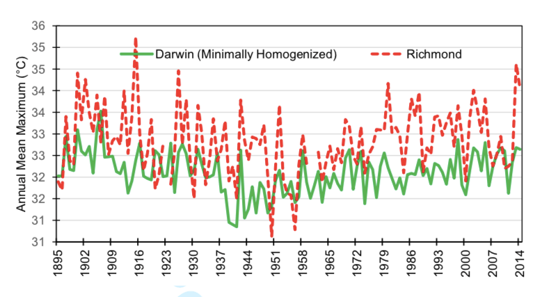
There are few locations across Australia where temperatures have been recorded at the one place and using standard equipment (including in a Stevenson screen with a mercury thermometer) much before 1908. Darwin in the Northern Territory and Richmond in Queensland are special because they have long and relatively reliable temperature records. Making a single adjustment to the Darwin temperature record to correct for the move from the post office to the airport (after the post office was bombed in WW II), it is evident from the chart that both temperature series show cooling and then warming over the last century and by much more than 1.5 C over periods of less than a decade.
This is the case across the Earth: that temperatures tend to cycle at a decadal scale and by much more than 1.5 C.
Back in 2014, John Abbot went through the Australian Bureau of Meteorology’s data base of unhomogenised temperatures for New South Wales. He picked out those temperature series that were continuous from before 1900 to 1960 and post 1960 to 2013.
He choose 1960 as the point of division, because annual maximum temperatures from Australia tend to show cooling to about 1960 and then warming after that year and because if we divide in about 1960 it is easier to find more stations. (Coonabarabaran, Miller Street in Hay, Moruya Heads are about the only three. I can’t remember why he didn’t include Sydney Observatory Hill.)
It is evident from this table that over the sixty years to 1960 cooling is by much more than 1.5 C … denoted by the negative sign. At Deniliquin, cooling was by more than 4.5 as measured in degrees C per century.
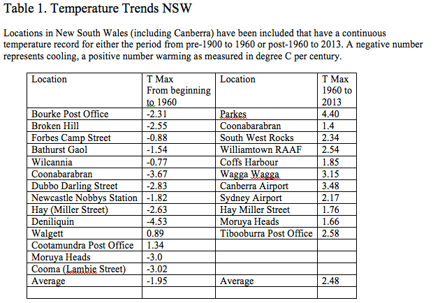
Since 1960 warming at most locations had already exceeded a rate of 1.5 C per century by 2013. On average, the rate of cooling in the maximum temperature was minus 1.95 to 1960, and on average the rate of warming was plus 2.48 after 1960. These are maximum values, and they give some idea of the absurdity of worrying about a mean temperature increase of 1.5 C since pre Industrial times.
That journalists at the ABC, and scientists at the IPCC, keep harping on about 1.5 C suggests they are clueless of our climate history.
It is only the remodelled temperatures, and also minimum temperatures from cities because of the embedded urban heat island effect, that show continuous warming.
The extent of the remodelling was detailed in that presentation I did to the Sydney Institute back in 2014, that included the table of NSW locations put together by John Abbot. The notes from that presentation are still so relevant, you can download and read them here.
Meanwhile, since about 2012 the reliability of the unhomogenised temperature data from Australia has become even more questionable as the Australian Bureau of Meteorology transitioned to a different probe design that reliably records up to 0.4 C warmer for the same weather than a mercury thermometer. My recent eight part series, Hyping Maximum Daily Temperatures, details this issue of non equivalence between the probes in automatic weather stations and old style mercury thermometers.
****
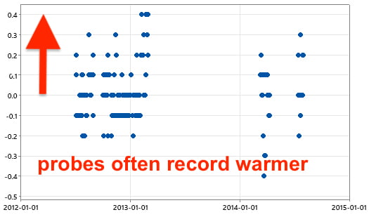
The feature image at the top of this blog post is a scatter plot of the difference between daily maximum temperatures from the probe at Mildura versus the mercury thermometer in the same Stevenson screen for the period July 2012 to January 2015. All available parallel data has been plotted, minus a few outliers. This is the extent of the parallel data available for the second generation probes for the entire Australian continent, unless our Administrative Appeals Tribunal Hearing is successful. Fingers crossed.
Mediation has not yet terminated; I have nothing to report beyond what I wrote in part 4 of Hyping Maximum Daily Temperatures.
 Jennifer Marohasy BSc PhD is a critical thinker with expertise in the scientific method.

My worry is the pH of sea water in the Antarctic and the effect that it has on the CaCO3 skeletons of the crustacea
ABC catastrophists warn “this time for sure”, time is running-out on climate-change
https://www.michaelsmithnews.com/2023/03/abc-catastrophists-warn-this-time-for-sure-time-is-running-out-on-climate-change.html
100 years of catastrophic sea-level rise
https://michaelsmithnews.typepad.com/.a/6a0177444b0c2e970d02b6852e963a200d-800wi
Google: Temperature curve last fifteen thousand years. Click on images.
Graph: Is a single green line.
We are the coldest it has been for 10,000 years
The Roman Warming was 2 degrees warmer. Their crops boomed.
I like your work Jennifer.
Average global temperatures cycle on a decadel scale as JM states whilst the politicians only look at temperature periods when they are rising and ignore or alter data which contradicts their narrative. Nature will make fools of the politicians because it does not follow a political agenda.