
My good friend Patrick Lloyd, enamoured with the new Artificial Intelligence ChatGPT, sent me maximum temperatures for Tasmania as individual annual averages of all the daily values for all 155 weather stations since 1882. He had downloaded these values from the Australian Bureau of Meteorology’s website with the help of ChatGPT. He wanted to know from me if they showed global warming.
After importing the numbers into my statistical program, I drew a scatter plot with a fitted regression line, Chart 1. It suggests that maximum temperatures in Tasmania are not as high now as they were back in the early 20th century, and that there was a period of cooling to about 1950.
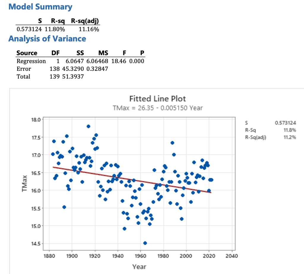
The regression equation indicates that overall, there has been cooling at a rate of 0.0051 degrees Celsius per year. Converting this into climate change speak we get a rate of cooling of 0.5 C per 100 years. This doesn’t sound right, does it?
The official historical reconstruction for Tasmania also shows temperatures cooling to about 1960, and then temperatures increasing such that since at least the year 2000, it has been very hot, Chart 2.
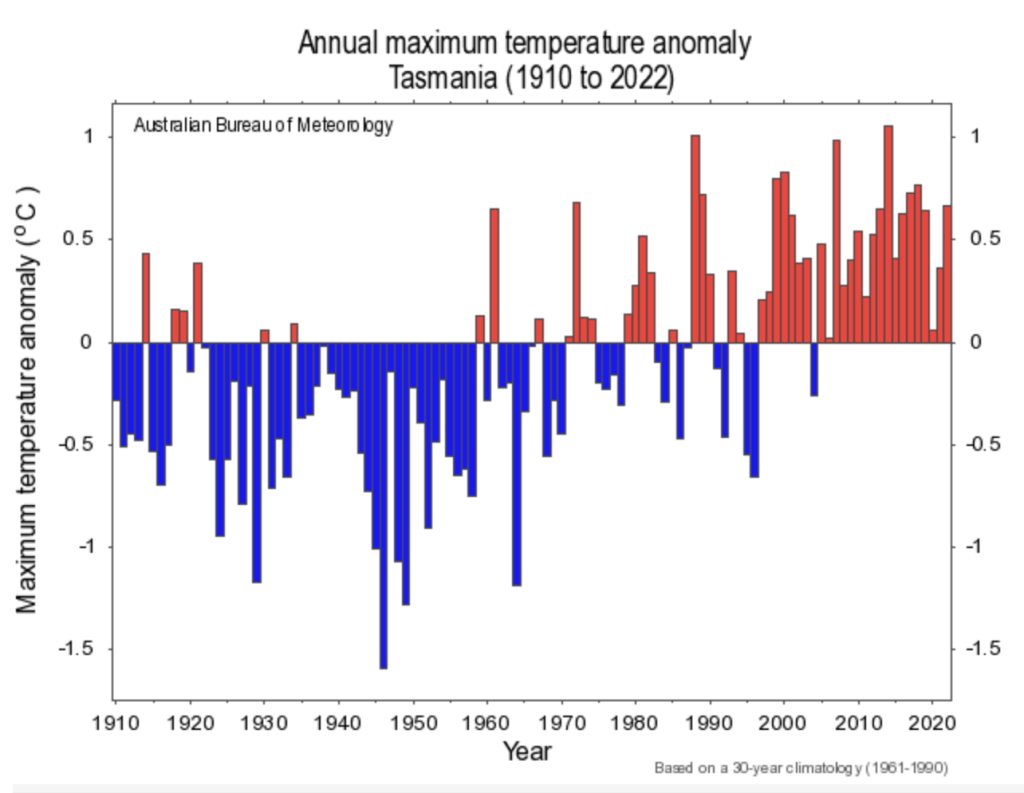
Clearly the official maximum temperature reconstruction for Tasmania is not just an amalgamation of all the maximum temperature series. Charts 1 and 2 show very different overall trends, though both show cooling to about 1960.
Is the Bureau’s historical reconstruction (Chart 2), a more accurate representation of historical temperatures for Tasmania than the annual mean of all the daily values that ChatGPT sourced for Patrick (Chart 1)?
Every temperature series has its limitations, and sometimes issues are just compounded when many temperature series, beginning at different times and from different locations and altitudes, are just combined. That is what Chart 1 represents, a simple compilation of everything available. It needs checking.
Patrick has suggested a solution might be to just combine the longest and most complete maximum temperature series, perhaps the best 10 percent of the 155 weather stations, and throw the rest out.
But there is an additional potential problem.
Since 1 November 1996, the Bureau have been transitioning from mercury thermometers to probes in automatic weather stations for the measurement of this temperature data. Probes in automatic weather stations represents a fundamentally different way of measuring temperatures than the traditional mercury thermometer where the daily maximum used to be manually read at 9am each morning and then the mercury reset.
Could it be that the automatic weather stations are recording hotter for the same weather?
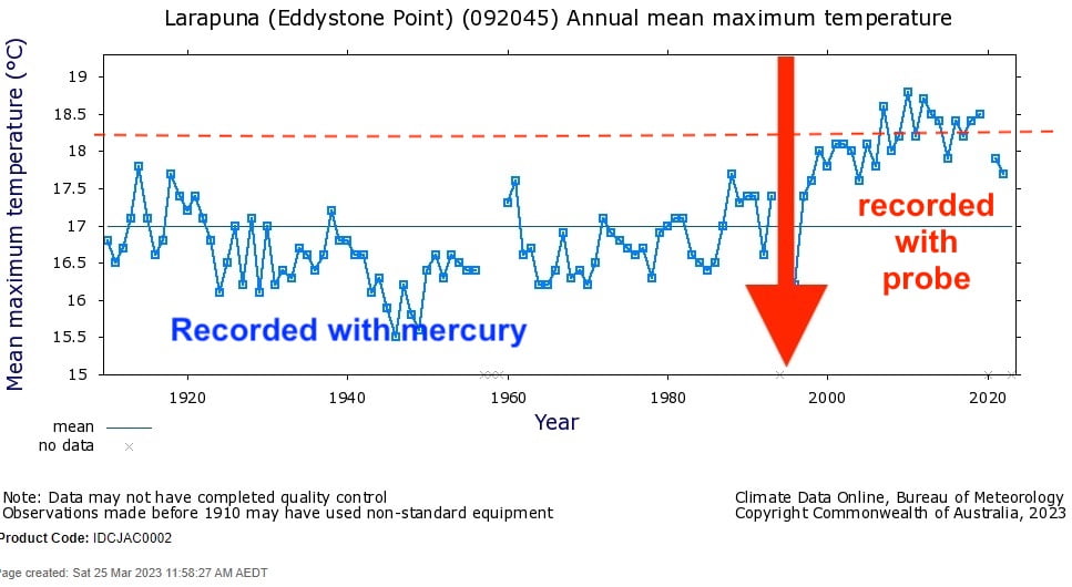
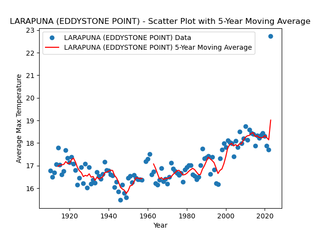
Considering just Larapuna (also known as Eddystone Point, station number 092045), as an example, this weather station has a long and relatively compete temperature record. Larapuna would represent one of the ‘best 10 percent’ from Tasmania.
Chart 3 shows the annual average maximum temperatures (unhomogenised) as measured at Larapuna first using a mercury thermometer, and since 1997 with a probe in an automatic weather station.
Considering maximum temperatures for this location there does appear to be a jump-up of more than 1 degrees Celsius after about 1997.
How can we know if this apparent step-change circa 1997 was caused by a change in the weather, or a change in the equipment used to measure the temperatures at Larapuna?
I’ve said to Patrick, that before we begin combining the individual temperature series I would like to sort out the issue of the change from mercury to probe. In fact, this issue has been preventing me continuing with a reconstruction of Australia’s temperature history for some years now.
The probes are generally considered to be more responsive to fluctuations in temperatures and, therefore, likely to record both hotter and colder for the same weather. This is stated in the Bureau’s Research Report No. 032 The Australian Climate Observations Reference Network – Surface Air Temperature (ACORN-SAT) Version 2 (October 2018) by Blair Trewin:
In the absence of any other influences, an instrument with a faster response time will tend to record higher maximum and lower minimum temperatures than an instrument with a slower response time. This is most clearly manifested as an increase in the mean diurnal range. At most locations (particularly in arid regions), it will also result in a slight increase in mean temperatures, as short-term fluctuations of temperature are generally larger during the day than overnight.” (Page 21)
Perhaps because Tasmania is neither particularly hot, nor particularly arid, we don’t need to worry about the change over? I wonder what ChatGPT thinks? I wonder if ChatGPT can solve the equipment change over problem?
How much hotter and how much colder the probes record relative to an old style mercury thermometer will depend on the time constant intrinsic to that instrument and also on how it has been calibrated. Probes in automatic weather stations can be calibrated so the shift is uniformly in one direction.
If only we had parallel data for Larapuna, that is measurements taken from mercury thermometers and also probes in the same Stevenson screen, we could know the extent of the equivalence between the temperatures as measured with the different types of equipment. So far, the Bureau has been keeping the parallel data under wraps; the Bureau has a policy of not making the parallel data publicly available.
What are some of the other possible issues we might encounter as we combine the temperature series in search of the most accurate historical temperature reconstruction for Tasmania?
****
UPDATE MONDAY
ChatGPT, via Patrick, just gave me a scatterplot for Larapuna, through until yesterday.
UPDATE TUESDAY
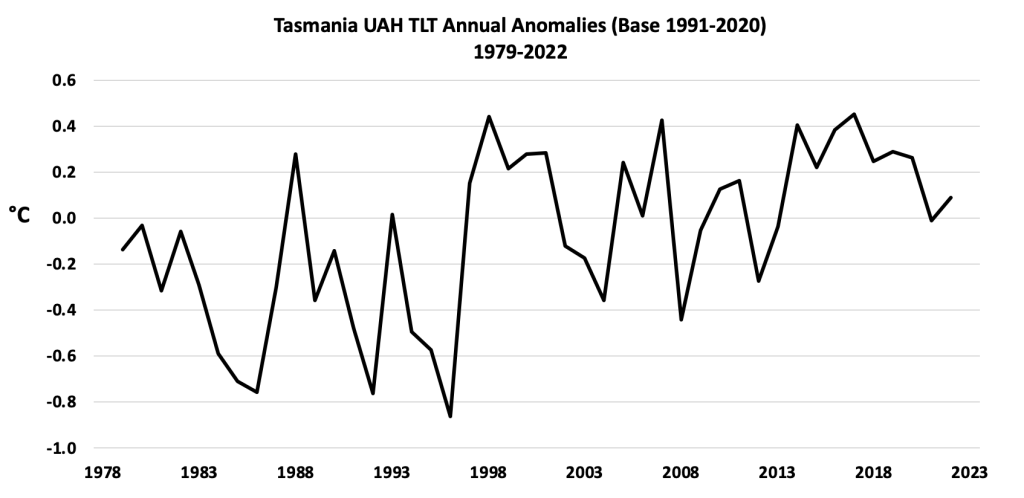
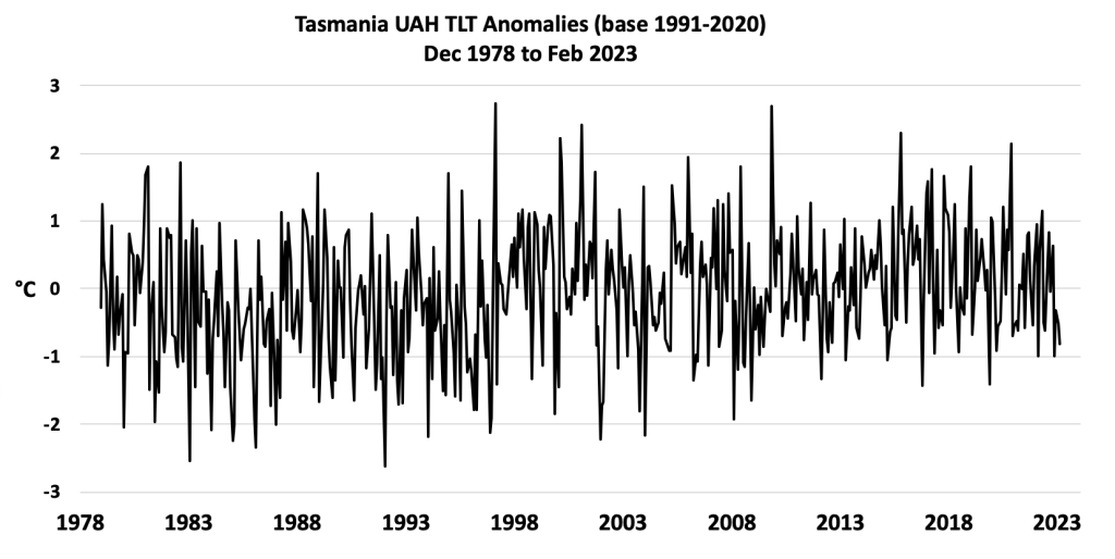
John Christy (Distinguished Professor, Atmospheric and Earth Sciences Director, Earth System Science Center Alabama State Climatologist, The University of Alabama in Huntsville) has been in touch.
Jennifer,
I read your piece on Tasmanian temperatures and wanted to see what the atmosphere above Tasmania has been doing. Attached are the results from our Lower Tropospheric dataset. It looks like the peaks in 1998 and 2017 are indistinguishable. The upward shift in temperature from 1996 to 1997 looks real, but not much has happened since then. The overall trend is +0.15 C/decade with the trend from 1997 to present being +0.02 C/decade.
The upper air is representative of the broader circulation in the region, so may not be able to represent the surface temps well. However, since it is a bulk atmospheric measurement, it will have a better capability to capture the influence of extra greenhouse gas forcing.
*****
This is the first of a new series of blog post about reconstructing Tasmania’s temperature history with the help of Patrick and ChatGPT.
If you would like to follow along as the three of us attempt to understand how and why the two temperatures series (Chart 1 versus 2) are so different and attempt our own historical temperature reconstruction for Tasmania then, consider subscribing at my website, specifically click the box ‘Temperature Trends’ and you will start receiving information on this topic.
The photograph is of Patrick and me in front of the weather station in Tewantin, Queensland.
 Jennifer Marohasy BSc PhD is a critical thinker with expertise in the scientific method.

The BOM will face a major problem when their temperature probes start to contradict their climate change narrative as the impact of below average solar activity results in a slowly increasing decrease in mean annual temperatures.
Hi Richard
The BOM faces no ‘major problem’.
The BOM can simply keep recalibrating the probes so they record consistently warmer for the same weather.
I have shown with the limited parallel data I have for Mildura that probes can record consistently, and statistically significantly, cooler and also warmer, by some fractions of a degree Celsius relative to a mercury thermometer.
Blair Trewin acknowledges on page 20 of Bureau Research Report 032 that where there are differences of some fractions of a degree between ‘manual and automatic instruments’ (the words he uses) and that ‘these differences are primarily accounted for by the probe being slightly out of calibration’.
It is not difficult to recalibrate a probe to record slightly warmer than a mercury for the same weather, and slightly warmer again.
At Larapuna the probe has been changed four times on 24th July 1997, 13th October 2004, 30 July 1998, and 9th July 2020.
I don’t know how many times it has been calibrated, and re-calibrated.