Thanks to everyone who has enquired about the outcome of the Administrative Appeals Tribunal hearing with John Abbot versus the Bureau of Meteorology first heard on 3rd February in Brisbane. Unfortunately, mediation has not yet ended, and so there is nothing that I can report beyond my note from 4th February. Hopefully I will have something to report by the end of April.
At the end of each month I usually send out an email update via MailChimp, you can subscribe here. These updates no longer make it through the university spam filters with my Climatelab email address now marked as a source of disinformation. To know how that works read The Twitter Files. Anyway, there is also the problem of these emails being increasingly caught in more regular spam filters, so for a limited period of time, at least this month, I am posting a version of this monthly update here.
One of the first detailed studies of climate change in Australia was by E.L. Deacon published in the Australian Journal of Physics back in 1953. The Professor identified a period of significantly higher mean summer maximum temperatures during the period 1881 to 1910, than during the subsequent period 1911 to 1940. This early study, based on raw observational data from mercury thermometers, concluded that ‘the good consistency of the changes suggests the cause to be mainly climatic rather than changing observational technique or exposure’ (p. 213). To be clear, the professor was claiming the thirty years before 1910 to be hotter than the next thirty.
The chart from the same article shows dramatic cooling to circa 1950 and of more than 1.5 degrees Celsius. I posted the chart at my blog back in 2014, with comment that more people died in Australia from extreme heat events in 1896 than in any other year, with 450 dead nationally. The second worst year was 2009 with 432 dead, followed by 1939 with 420.
All this history is being forgotten. Buried. Denied.
The claim is that the data before 1910 was recorded with non-standard equipment because the mercury thermometers where not always in Stevenson screens. In fact, since 1 November 1996 when the Bureau began transitioning from mercury thermometers to probes in automatic weather stations the Bureau has been using non-standard equipment. We really only have a reliable temperature record for Australia from the period 1910 to 1996.

Ignoring all of this, we have a new cultural obsession of not exceeding an illusionary 1.5-degree Celsius tipping point and it is truly bizarre.
Individually, and combined, Australian temperature series generally show that we have already exceeded this whichever equipment is used and whichever time periods are chosen. I blogged about this last week, including a table of data from locations in New South Wales with long records, showing we exceeded this tipping point more than ten years ago for many locations.
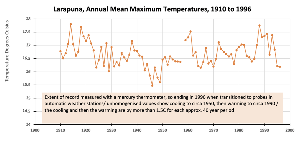
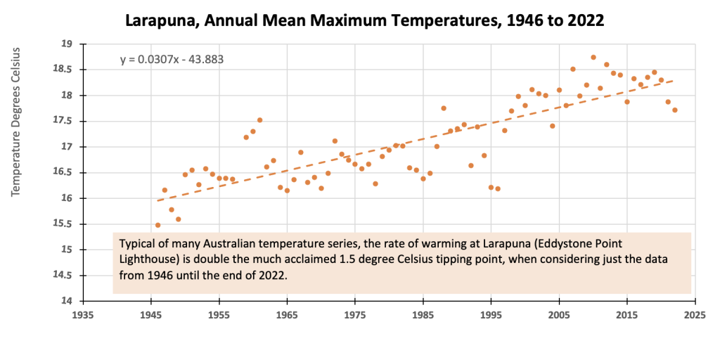
This week I’ve been looking at long temperature records for different parts of Tasmania, and you see the same pattern in these records. At Larapuna (Eddystone Point Lighthouse), for example, there is cooling of more than 1.5 degrees Celsius to circa 1950, then warming at a rate of about 3 degrees Celsius per hundred years since.

I suspect the warming after 1 November 1996 is hyped in the official record, because that is when the Bureau started transitioning to probes in automatic weather stations. Over the last month or so I’ve written a whole series about this in 8 parts at my blog, entitled ‘Hyping Maximum Daily Temperatures’. Part 6, is here; type ‘hyping’ into the search bar at my website and the others should appear. The entire series was also republished at Watt’s Up with That, with many comments showing much emotion, certainly more emotion than common sense that can be so disheartening.
The reliability of any historical temperature reconstruction becomes difficult because of the emotion and also, after 1 November 1996 in Australia, the transition away from mercury thermometers.
To satisfy my own curiosity, and sort out the possible mess, I would so like access to the parallel data, which are the measurements from mercury thermometers in the same weather stations as the new probes recording with automatic weather stations.
The Bureau has a policy of not allowing this data to be made public. Making this data public is the point of our Administrative Appeals Tribunal Hearing that is still in mediation. Hopefully I will have something to report by the end of April, hopefully there will be some news by then.


 Jennifer Marohasy BSc PhD is a critical thinker with expertise in the scientific method.

The BOM does not want parallel data made public because it will expose the errors of the BOM’s methods.
I sometimes wonder if, as this whole AGW thing is so important, according those that feed from it, why it is not possible to build a fully automated ‘original’ robotic weather station using mercury thermometers and water capture and measure using digital cameras and AI run via solar panels. At least this would give a true ‘like for like’ comparison instead of new, questionable, non-standard equipment.
A couple of servo-motors and mechanical arms to shake the thermometer or empty the vessel after reading and taking said digital photo is all that’s needed. How difficult can it be with the technology that’s available today? It could all be run from a Raspberry Pi, backup battery and 5G telecoms card at very low cost.
Hi, I keep hearing how Sth Australia are able to use 24 hour renewable energy.
I just don’t think this is achievable, could you shed some light on this please.
John Lloyd
I think that any transition from one means of measurement should have parallel sets for comparison. This is proper. As it is, there seems to be discrepancy. The Bureau seem evasive.
Would it be worthwhile to find some funding to set up original Stevenson screens , along with the new temperature equipment under some research organisation directions. It would be best near existing stations. . If the BOM would not cooperate they could be accused of hiding information. Best of luck with your endeavours.. Trevor
It’s worth noting that there was a sharp reduction in annual rainfall at Larapuna for several years after 1996.
The BoM CDO rainfall data has one year missing (1994) in the five years before 1996, and three years missing in the five years after 1996 (1998, 1999, 2001).
These are because of missing months when the rain gauge was presumably out of action. However, averages for those months over the 11 years can be substituted for the missing months, resulting in an annual average 674.3mm in 1991-1995 and 550.3mm in 1997-2001. i.e. an annual average rainfall reduction of 18.4%.
This makes it difficult to estimate the 1996 AWS short-term influence, but two years are candidates for comparison … 1995 with 672.8mm and 2000 with 665.6mm.
About 7mm less rainfall in 2000 but that should have minimal influence on average temperatures.
Larapuna’s average maximum in 1995 was 16.3C and the average maximum in 2000 was 17.8C.
I doubt that 7mm less rainfall could cause a 1.5C higher maximum.
Larapuna’s average minimum was 9.5C in 1995 and 10.9C in 2000. If rainfall is influential and there was 7mm less, normally a slightly cooler minimum might be expected – not a 1.4C warmer minimum.
The rainfall comparison gives cause to suspect the AWS, so let’s look deeper into 1995 vs 2000.
In 1995, Larapuna had 17 days at or above the station’s long-term 90th percentile temperature (21.7C) and those 17 days averaged 22.9C.
In 2000, Larapuna had 56 days at or above the station’s long-term 90th percentile temperature and those 56 days averaged 23.6C.
In 1995, Larapuna had 4 days at or above the station’s long-term 95th percentile temperature (23.1C) and those 4 days averaged 25.2C.
In 2000, Larapuna had 21 days at or above the station’s long-term 95th percentile temperature and those 21 days averaged 25.7C.
In 1995, Larapuna had 1 day at or above the station’s long-term 99th percentile temperature (26.2C) and that day was 29.4C.
In 2000, Larapuna had 4 days at or above the station’s long-term 95th percentile temperature and those 4 days averaged 29.3C.
So at the absolute extreme of 99th percentile the average max was 0.1C cooler, although a comparison of 1 vs 4 days means the error margin is probably as wide as the Grand Canyon.
The number of 90th percentile days was 229.4% more in 2000 than in 1995, and there was a 425% increase in 95th percentile days. They were 0.7C and 0.5C warmer respectively.
How about the 50th percentile, so the warmer half of all days each year?
In 1995, Larapuna had 144 days at or above the station’s long-term 50th percentile temperature (16.7C) and those 144 days averaged 19.4C.
In 2000, Larapuna had 211 days at or above the station’s long-term 50th percentile temperature and those 211 days averaged 20.3C.
So temperatures in the warmest half of all days in 2000 were 0.9C warmer than in the warmest half of all days in 1995, despite very similar rainfall throughout both years.
1995 with 672.8mm of rainfall is also worth comparing with 2003 at 727.6mm. That’s 8.1% more rainfall, so 2003 should be cooler than 1995.
Average maximum 1995 = 16.3C. Average maximum 2003 = 18.0C.
2003 was 1.7C warmer than 1995, despite more rainfall.
1995 90th percentile = 17 days / 22.9C
2003 90th percentile = 82 days / 23.7C
1995 95th percentile = 4 days / 25.2C
2003 95th percentile = 36 days / 25.3C
1995 99th percentile = 1 day / 29.4C
2003 99th percentile = 6 days / 28.8C
1995 50th percentile = 144 day / 19.4C
2003 50th percentile = 202 days / 20.9C
Again the 99th percentile is a very low number of days for comparison, but the lower percentiles in the warmer half of days allow a large enough number for a valid comparison. Both the frequency and average temperature of these warmest and extreme percentile days strongly suggests instrument change rather than climate change.
However, Larapuna also had a small Stevenson screen installed in 1997, so it’s difficult to figure out exactly which instrument change.
Many care but do not have the knowledge to call BS on the narrative.