It is assumed that temperatures measured at official recording stations with mercury thermometers – by their very nature of being in the past – cannot be changed. But in climate science numbers are continually changed. It is the remodelling of maximum and minimum temperature series before they are combined to calculate the mean, and then added all together, to generate an overall annual average temperature for Australia, that most affects the amount of warming announced at the beginning of each year by the Australian Bureau of Meteorology.
The remodelling, also known as homogenisation, has a very subjective component. Past temperatures are cooled, with more cooling the further back in time. But the issue of homogenisation is not the only problem with the artificial construct that is Australia’s historic temperature record. There is also the issue of choice of weather stations and how the individual temperature series are combined to create the single series.
A new official historical temperature reconstruction for Australia is created at the beginning of each year from The Australian Climate Observations Reference Network – Surface Air Temperature (ACORN-SAT) database.
At the beginning of each year there is usually also a media release that explains how much this vast continent has warmed – even if the last year was unusually cool because of La Nina conditions. The impression is always that temperatures are increasing, and in a linear fashion. There is never any mention of the Federation Drought (1895 to 1903) because the ACORN-SAT database only begin in 1910. Hot years before 1970 are cooled down, so that the annual averages when presented as a time series no longer show cooling to 1960. Rather the numbers show continuous warming from 1910 – consistent with catastrophic global warming theory. Let me now show, in more detail, how this is done and with reference to the 2021 Annual Climate Statement.
The 2021 Annual Climate Statement
Curiously, the 2021 Annual Climate Statement was released a month late, in February. It concluded by claiming a value for warming across Australia since 1910 that ended in 2020 – missing a whole year of data. The last year of data.
I downloaded the 1910 to 2021 ACORN-SAT values from the Bureau website and did my own analysis wondering if perhaps the reference to 2020 was a typo. I also contacted the Bureau about this. They have acknowledged my email but so far not responded. That was a week ago.
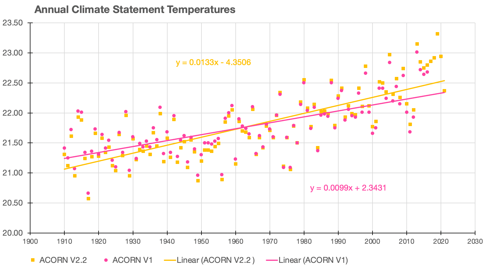
When I plot the values 1910 to 2021 for the latest version of ACORN-SAT – version 2.2, and I’ve included version 1 to show how historical values have changed since 2018 – it is evident that there is a rate of warming of 1.33 degrees Celsius per century from the regression equation (y = 0.0133x-4.3506). To calculate the actual amount of warming, the value of 1.33 is multiplied by the number of years between 1910 and 2021 (the number of observations, 112) and then divided by 100. This gives an amount of warming of 1.49 degrees Celsius, which could be rounded to 1.5 °C. 1.5 °C! That is the amount often mentioned as the dreaded tipping point.
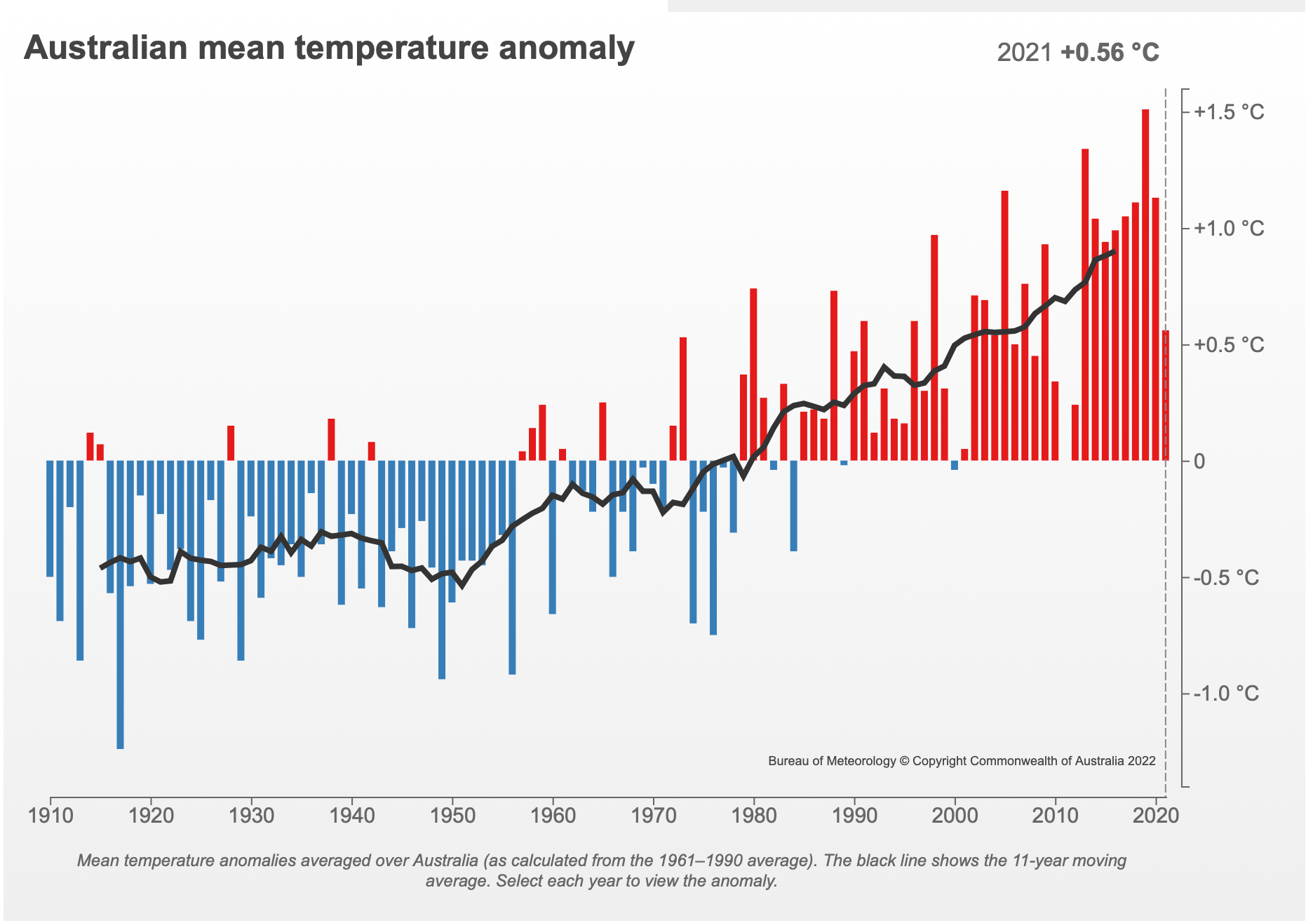
An important meeting of Intergovernmental Panel on Climate Change (IPCC) scientists began just recently (early February 2021) to discuss the agreed amount of global warming as 1.1 °C, and the consequences if ‘global heating’ passes the tipping point of 1.5 °C. The Paris deal calls for capping of global warming at well below 2 °C, and ideally below 1.5 °C.
It has occurred to me, the Bureau might be perceived by the IPCC and others as having overreached in its remodelling of historical trends if it announced an amount of warming of 1.5 °C for 2021, and during a cooler than usual La Nina period.
Official Weather Stations with Long Records, Still Using Mercury Thermometers
Coonabarabran (Station Number 64008)
Most rural and regional temperature series show cooling to 1950, or 1960 and warming since. With temperatures now, about as hot as they were back in 1914 and 1915. They are like the very long series from Coonabarabran; a town in outback New South Wales that began with an official government weather station in 1880. The measurements from this weather station suggest an overall warming trend of 0.64 °C since 1910 – when plotted as a linear trend. This is an amount of warming of 0.71 °C when calculated for the period 1910 to 2021.
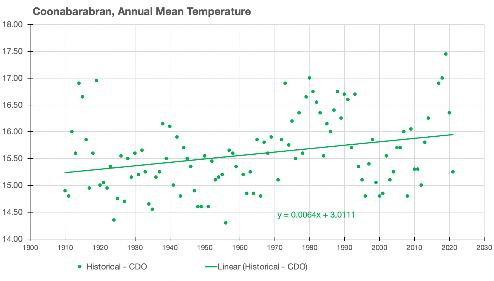
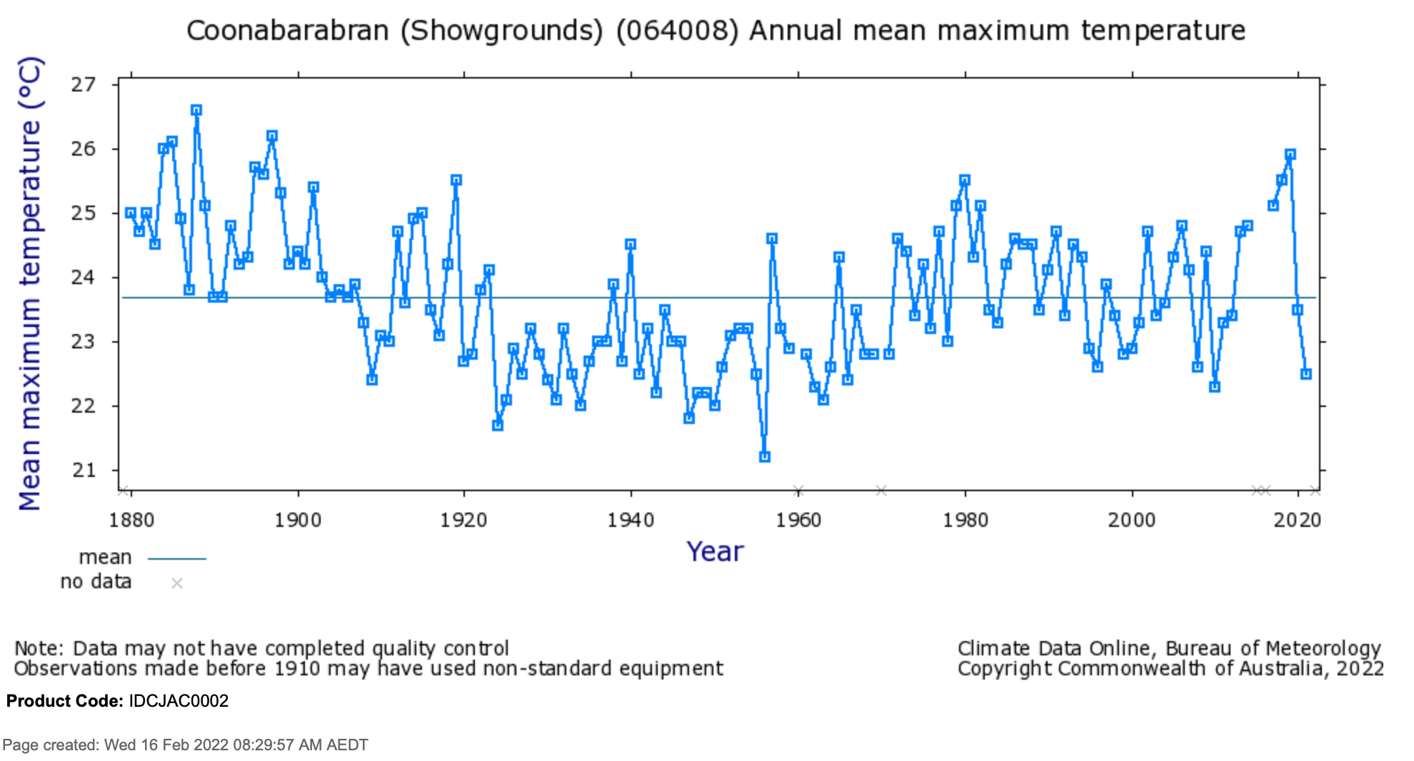
Coonabarabran has one of the longest and most complete temperature record for anywhere in Australia. Yet curiously it is not included in the 104 stations from the ACORN-SAT database used to calculate official temperature trends across Australia. It is also one of the few official weather stations in Australia that still records maximum temperatures using a mercury thermometer.
Richmond (Station Number 030045)
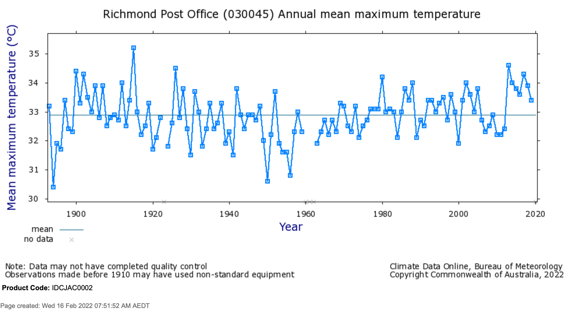
Richmond, a town in outback Queensland also has a very long record with measurements that extend back to 1893. The temperatures show an overall cooling trend from 1910 until about 1950. Then there is warming after this. This record only extends until 2019, with the weather station closed in early 2020.
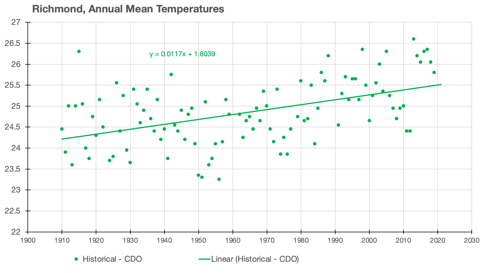
The very hottest year in this long (1893 to 2019) Richmond temperature record is 1915. This is typical of many inland locations across northern Australia, though it contradicts the official narrative. The hot year (1915) has been remodelled out of the homogenised series by dropping down the mean annual temperature in this year by 0.8 °C. This is what the remodelling routinely achieves: it cools the past making the present appear warming for the same weather.
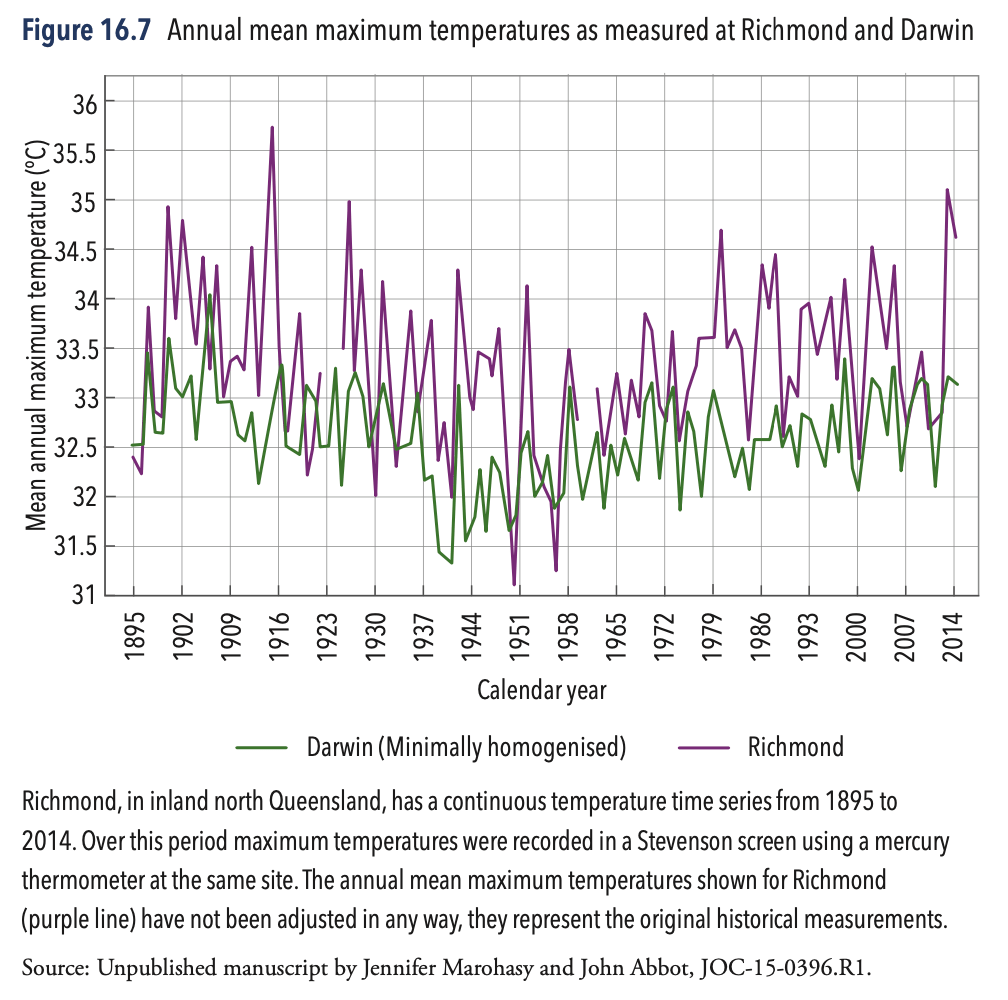
A few years ago I used the long continuous maximum temperature series from Richmond to compare with the maximum temperature series from the city of Darwin. Darwin is by the sea and the weather station was moved from the post office to the airport and there have been equipment change. A detailed statistical analysis of both series was undertaken in 2014 and submitted to The International Journal of Climatology for peer review. Following major revisions to the manuscript (as requested by the editor) it was accepted for publication on 7 December 2015. But then instead of receiving the galley proofs I received a letter from the editor explaining that the manuscript had been subsequently rejected and without providing any logically consistent reasoning. I was devastated. That manuscript represented a lot of work.
ACORN-SAT Reference Stations, Some Examples
All 104-temperature series used to create the official historical temperature reconstruction for Australia, which is shown as part of the Annual Climate Statement at the beginning of each year, have been remodelled. The minimum and maximum are homogenised working from daily values, and then averaged to create the remodelled mean value for each year.
There are very few temperature series that have been recorded continuous at the same weather station at the same location since 1910, and so it is mostly a case of combining series that began with measurements at, for example a post office, with values continuing from an airport. I’ve chosen to show the two stations beginning with ‘A’ from the ACORN-SAT database – least I be accused of cherry-picking – to show that this tendency to cool the past extends to stations in other parts of Australia specifically Albany and Alice Springs.
But let me first continue with Richmond and show the latest 2021 homogenised series.
Richmond, Queensland
When a weather station is closed down as was the case with Richmond (Station Number 030045) in early 2020, the Bureau typically finds a nearby station and adds that series onto its end. So, the temperature series for ‘Richmond’ becomes an amalgamation of measurements from at least two locations. When this happens the temperatures in the original series are typically adjusted down by the Bureau as part of the process of homogenisation. The series is also truncated, to begin in 1910.
The homogenised official temperature series for Richmond has a rate of warming of 1.7 °C per hundred years, suggesting an amount of warming of 1.9 °C since 1910. This would suggest that warming at Richmond has exceeded the tipping point of 1.5 °C.
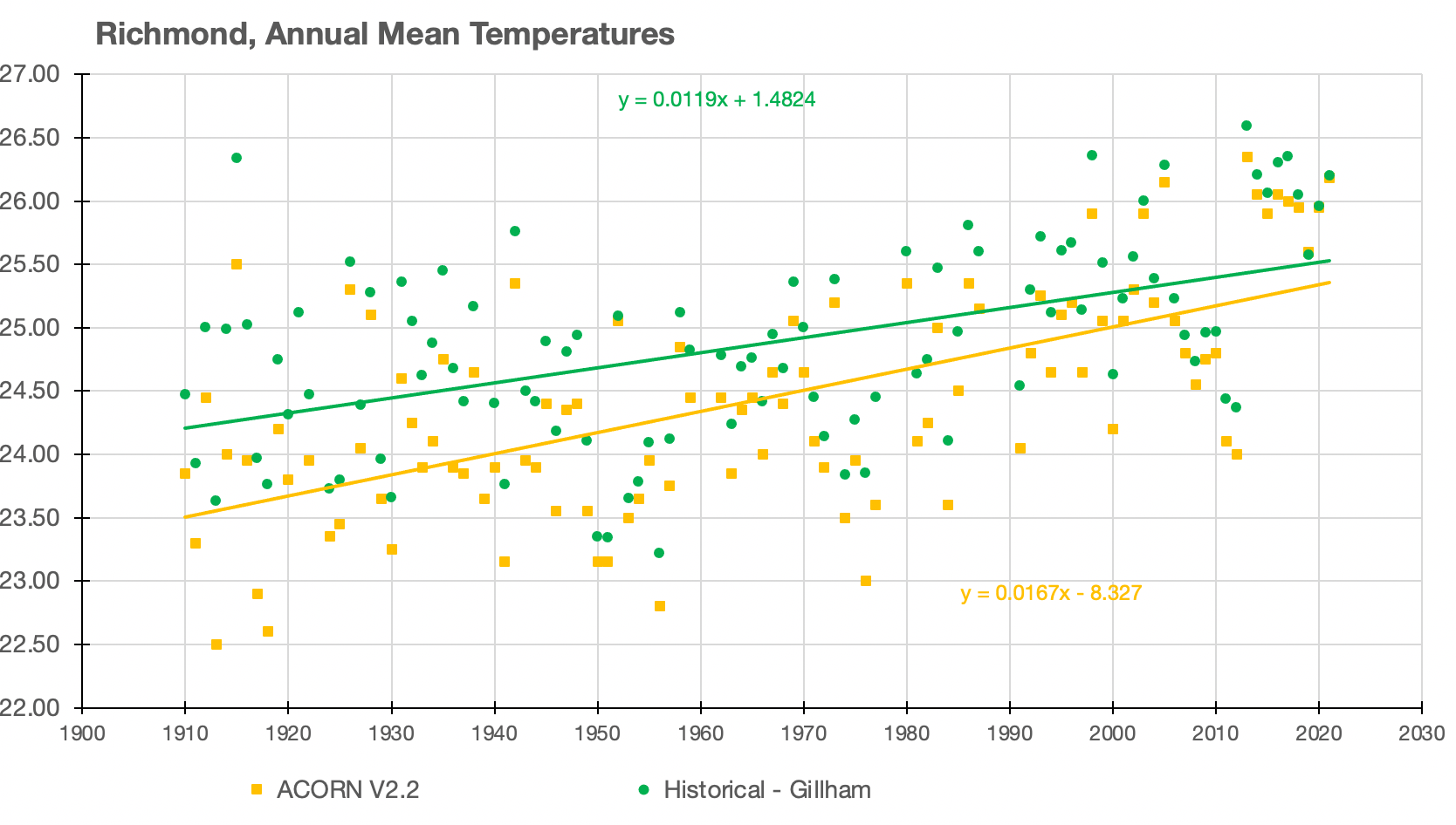
Yet the very long maximum temperature series as shown in Chart 5, suggests that temperatures at Richmond cycled down to about 1950, and then up again to the present with 1915 an exceptionally hot year – the hottest on record. The unhomogenised, original maximum temperature series does not suggest that temperatures have reached a tipping point, or that linear regression would be the most appropriate statistical description of this data set.
Rutherglen, Victoria
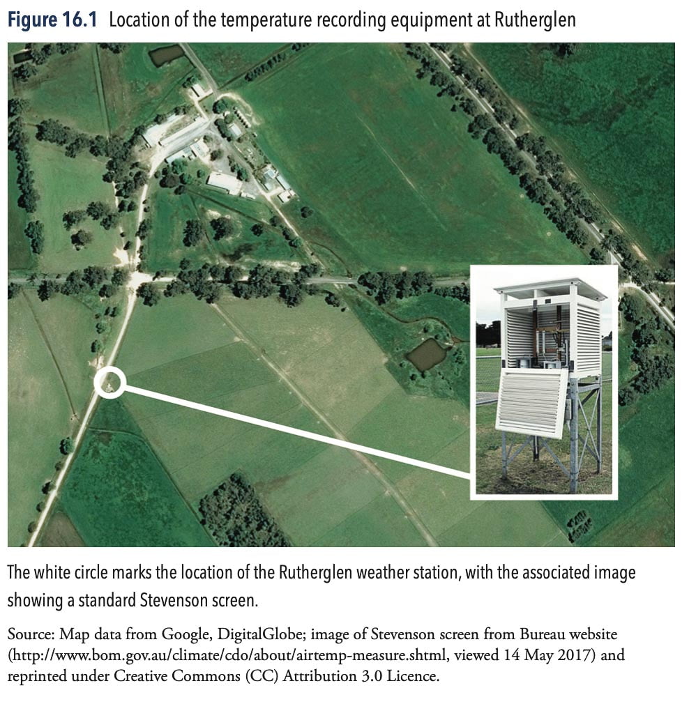
At an agricultural research station near Rutherglen in south-eastern Australia, maximum and minimum temperatures have been recorded since November 1912 in a Stevenson screen in a paddock, as shown in Chart 9. This is an official ACORN-SAT weather station with values used to calculate the annual mean temperatures as reported in the Annual Climate Statement. The trend in the raw minimum temperatures is slight cooling that is at least in part a consequence of land-use change: specifically, the staged introduction of irrigation into the region for cropping, vineyards and orchards.
In 2014, Graham Lloyd, Environmental Reporter at The Australian, quoting me, explained how the cooling trend in the minimum temperature record at Rutherglen had been changed into a warming trend by the Bureau by progressively reducing temperatures from 1973 back to 1912. For the year 1913, there was a large difference of 1.8 °C between the mean annual minimum temperature, as measured at Rutherglen using standard equipment at this official weather station, and the remodelled ACORN-SAT version 1 temperature. Remodelling the data to cooling the past relative to the present in this way has the general effect of making the present appear hotter.
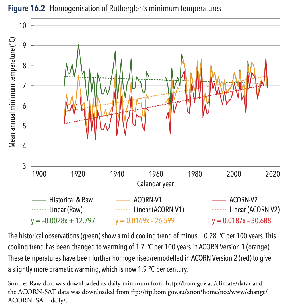
The Bureau responded to Lloyd, claiming the changes were necessary because the weather recording equipment had been moved between paddocks. This is not a logical explanation where the local terrain is flat and, furthermore, the official ACORN-SAT catalogue clearly states that there has never been a site move.
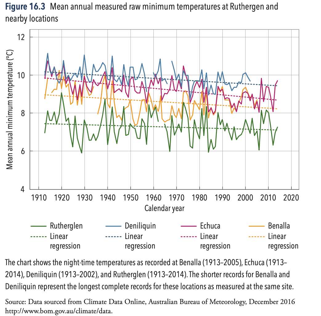
In subsequent correspondence with Lloyd the Bureau claimed the remodelling was necessary to make the temperature series at Rutherglen consistent with other temperature series in that region. Yet the cooling trend in the minima at Rutherglen are consistent with temperature series from the nearby weather stations of Deniliquin, Echuca and Benalla.
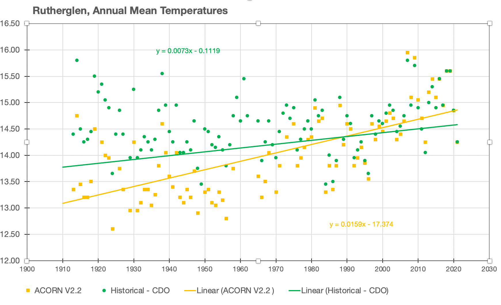
Considering the actual (unhomogenised) historical mean annual temperature for Rutherglen to the end of 2021 – the mean being the average of the maximum and minimum – the rate of warming is 0.7 °C per century (y = 0.0073x-0.1119). In the homogenised series this is increased to 1.6 °C per century (y = 0.0159x – 17.374).
By remodelling the temperatures, particularly the minimum temperatures, the Bureau changes a modest rate of warming into dramatic warming.
Albany, Western Australia
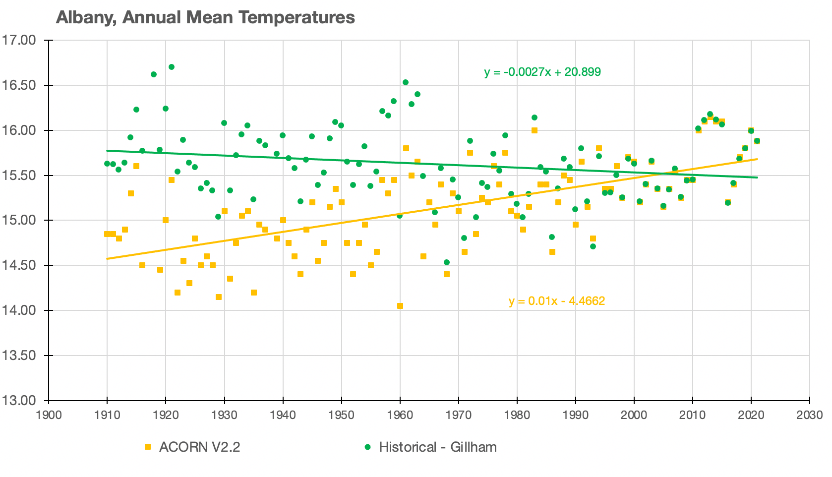
When the Bureau homogenised the mean annual temperatures at Albany, it turned a slight cooling of 0.3 °C per century into warming of 0.1 °C per century.
Alice Springs, Northern Territory
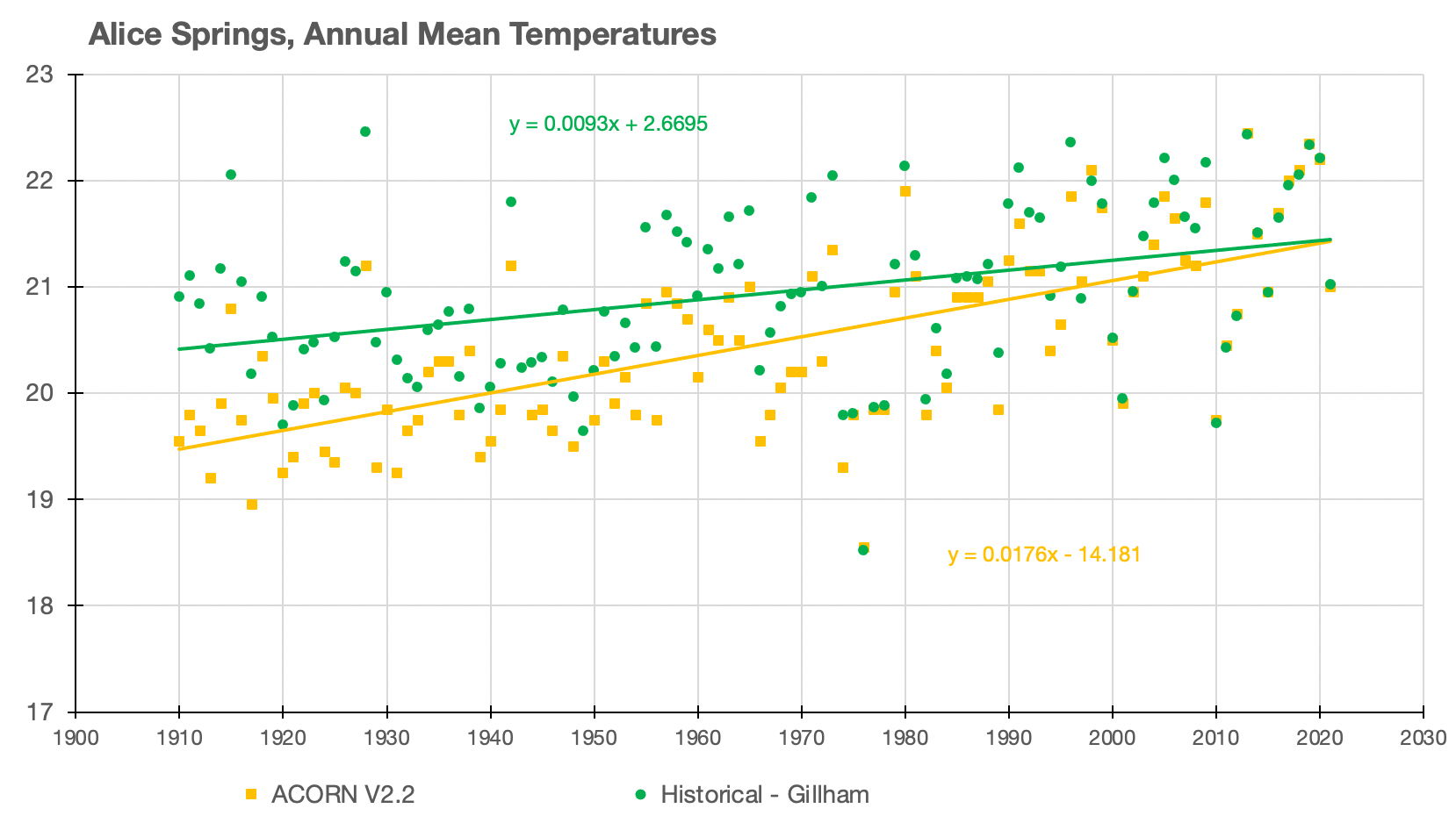
When the Bureau homogenised the mean annual temperatures at Alice Springs, it increased the rate of warming from 0.9 °C per century to 1.8 °C per century.
Combining Temperature Series of Different Lengths
The 2021 Annual Climate Statement concluded with comment that:
“Based on the ACORN-SAT dataset, Australia’s climate has warmed on average by 1.47 + 0.24 °C between when national records began in 1910 and 2020. Most of this warming has occurred since 1950.
These are statistics with mathematical definitions based on assumptions. But as far as I can determine the underlying assumptions have likely been violated because a different combination of stations is used to generate the official mean temperature for each year.
For example, the hot outback town of Oodnadatta only becomes part of the mix from 1941. The almost as hot and dusty town of Wilcannia is only added into the mix of stations used to calculate the annual average temperature for Australia from 1957, though temperatures were recorded at Wilcannia from 1910.
Oodnadatta
The homogenised series for Oodnadatta has a very similar rate of warming to the historical series. But Oodnadatta is a much warmer location than most, and so its addition to the official historical temperature reconstruction will have the effect of further increasing the amount of warming overall for Australia because it only begins in 1941.
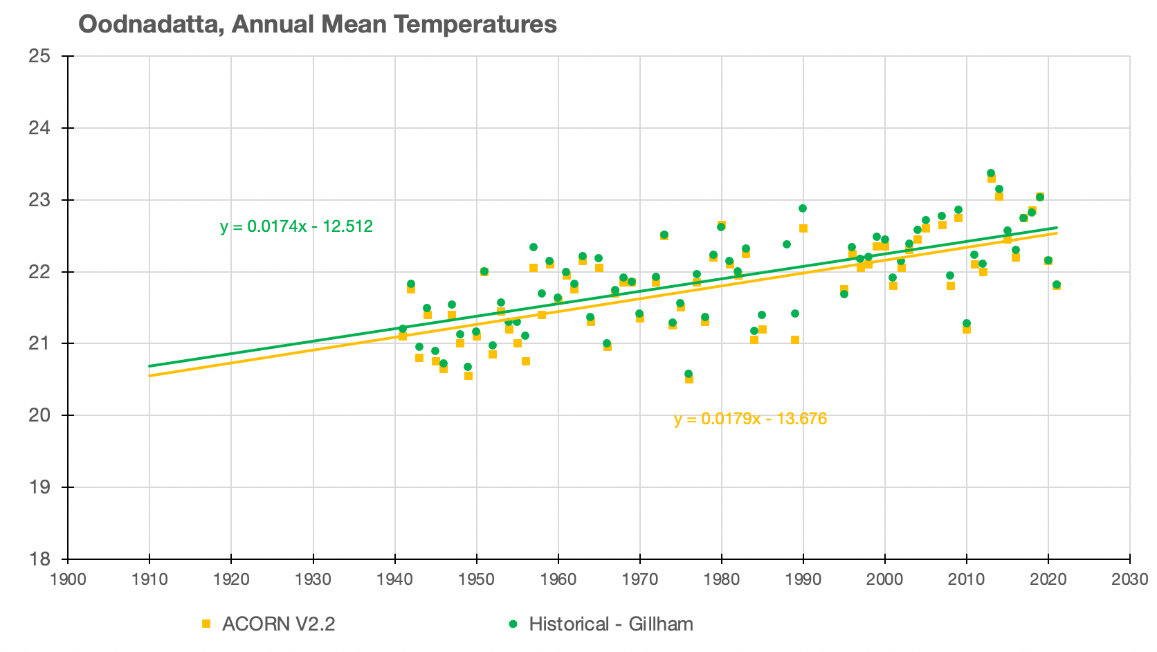
Adding hotter stations in later years (For example Oodnadatta and Wilcannia) will affect not only the rate of warming, but also make any comparison between years nonsensical because any warming may be a consequence of the choice of stations rather than any change in climate.
Yet these individual annual averages are not only combined into a single historical trend, but even assigned a standard error by the Australian Bureau of Meteorology in the Annual Climate Statements.
***********
This is part 2 of the series, Australia’s Broken Temperature Record. You can read part one here: https://jennifermarohasy.com/2022/01/australias-broken-temperature-record-part-1/
It is possible to see the extent of the remodelling for all 104 ACORN-SAT temperature series in an interactive table using maximum and minimum annual series. This table was constructed in 2019 and is yet to be undated with the latest values to 2021 and does not include the latest ACORN-SAT series, that is version 2.2. Click across and see all 104 historical versus homogenised series here: https://jennifermarohasy.com/acorn-sat-v1-vs-v2/

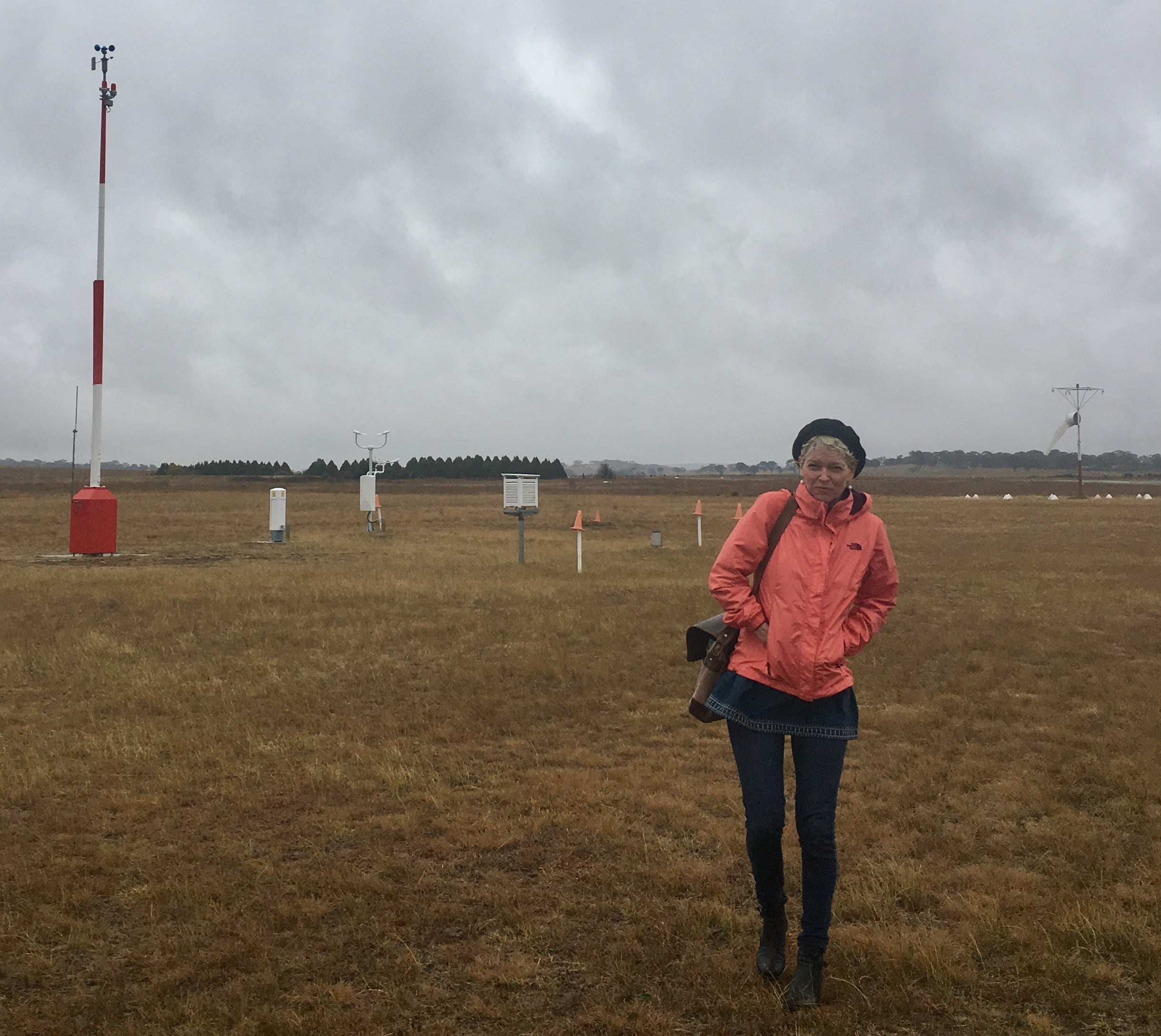
 Jennifer Marohasy BSc PhD is a critical thinker with expertise in the scientific method.

Thanks once again Jen, for your great work and attention to detail.
Having experienced 122f [50c] temps in Sturt’s Stony desert in the “cool” ’50s, I fully get. what these people are doing.
Also, human observations of mercury thermometers over long periods are very reliable compared with these modern digitals where they can be many degrees out of whack yet nobody gets around to doing anything about it for a month or two.
But this fakery at the bakery just has to be made more widely known if we we are going to survive.
One would think, with the ever-increasing population and the corresponding increase in size, extent and warming of urban areas, that it might occur to the BoM, IPCC et al, that cooling needs to be applied to modern temperatures to prevent false warming effects.
Also, when they closed all those Siberian weather stations at the fall of USSR in the early ’90s that must have had a big warming effect on recent temperatures.
But I suppose when F at the B is happening world wide, it’s no wonder our BoM feels quite comfortable about doing likewise.
Excellent piece Jennifer.
Cheers
“Political Science”: it’s everywhere.
“Solutions” in search of Problems”.
Interestingly, there seems to be a pre-ordained “timetable”, which appears to be rapidly “running out’; hence the “panic” and increasingly strident urging.
“Interesting Times” , indeed.
Excellent work Jennifer. It’s a disgrace that the corruption of historical weather data by the BOM is acceptable to politicians who must be held to account either through the ballot box or be sued for changing public policy to perpetuate the climate change fraud. In the UK the climate minister, Greg Hands, has admitted that the IPCC altered historical temperature data to create the warming scenario. Net-Zero is the new N word and is now a dirty word associated with corruption.
Thanks for the very detailed expose.
I don’t believe anything the BOM and their useful idiots reporting the weather on the nightly news say anymore. They peddle feelings not facts.
Outstanding work. There are 2 recourses: political and legal. Very few politicians are brave enough to run with this evidence of BOM homogenisation/fraud. And very few Judges would over-rule the expertise (sic) of the Bom as the NIWA case in NZ regrettably showed.
The possible 3rd alternative, a media blitz is out of the question given the partisan nature of the msm.
Regarding global warming, or cooling for that matter, one thing escapes me, i.e. how is the temperature determined.
I think it is the average of daily median (between max and min), as measured, estimated, or modelled. Please correct me if I’m wrong.
If we are really interested in whether global energy (not temperature) is going up or down, we would be using continuous temperature monitoring, which is now possible (though I assume not done).
And also taking into account humidity, wind, cloud cover.
Can’t see how we could otherwise establish any correlation between human activities and climate (not that we’re likely to find one anyway).
Another aspect which I don’t see discussed is the ability of humans and other creatures and plant life to adapt to changes in climate (e.g. simplistically like I adapted to a few years living near London, then came to Brisbane and didn’t need a jacket for 3 years).
Keep up the great work.