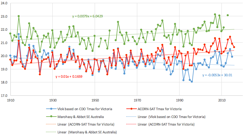
Media reports yesterday claimed that 2016 was another record hot year. However, close scrutiny of all the temperature data from the state of Victoria paints quite a different picture. When all 289 temperature series from Victoria are simply combined, the hottest years are in the early part of the record. In particular, 1914 is very evidently the hottest year on record – see blue time series in Chart 1. This finding builds on a recently published book chapter focused on south-east Australia, and is part of a larger study working towards a realistic reconstruction of Australia’s temperature history.

Yesterday the Australian Bureau of Meteorology released its Annual Climate Statement, claiming 2016 to be the fourth-warmest year on record for Australia – and also an unusually wet year. Wet years are usually much cooler years, but because the overall trend in the ACORN-SAT* time series shows significant warming, even a wet year comes out as relatively hot.
Of course there is no one place in Australia where the average temperature can be measured; so the Bureau relies on a reconstruction to determine how hot 2016 was, relative to the historical record. Their method, however, is quite subjective in terms of choice of locations to include, the method used to remodel the individual temperature series before they are combined (this is refered to as homogenisation*), and the area weighting applied – with the weighting changing on a daily and monthly basis.
Late last year, I had a book chapter, co-authored with John Abbot and published by Elsevier*, which shows historical temperature trends for south-east Australia from 1887 to 2013 based on a more transparent system – that can be easily replicated. We choose the longest continuous series, used the same series to calculate every value, and applied an area weighting based on topography and landuse – and did not remodel individual temperature series. In the chapter we conclude that temperature trends for south-east Australia are best described as showing statistically significant cooling (yes cooling) of 1.5 degree Celsius from 1887 to 1949, followed by warming of nearly 2 degrees Celsius from 1950 to 2013. The warmest year in this reconstruction is 2007, followed very closely by 1914.
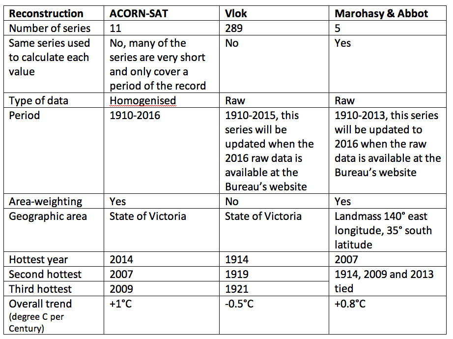
A colleague at the University of Tasmania, Jaco Vlok, has compared our south-east reconstruction with a reconstruction based on all 289 temperature series for Victoria – but only from 1910. The different methodologies used to generate these reconstructions, and also the official ACORN-SAT series for Victoria, which is the series used by the Bureau to calculate the official statistics for Australia, are detailed in Table 1.

There is a very high degree of synchrony between the reconstructions, though when all the raw data is simply combined – Vlok’s approach – the hottest years are all in the earlier part of the record: 1914 (hottest) followed by 1919, 1921, 1938, 1961 and then 2014.
Postscript: I have expanded on this analysis in an article just now published by Graham Young at OLO. Jennifer, Noosa, Monday 9th January, 2017.
_____
* ACORN-SAT stands for Australian Climate Australian Climate Observations Reference Network – Surface Air Temperature and is a dataset developed by the Bureau based on a subset of available temperature series, almost all homogenised, and then combined with an area weighting and used to report climate variability and change. The annual climate statement for 2016, based on this ACORN-SAT dataset, is here: http://media.bom.gov.au/releases/333/2016-a-year-of-extreme-weather-events/
* Homogenisation involves changes to measured temperature values ostensibly to correct for non-climatic variables. These changes to the observational data are quite different from quality assurance. For example, the need for homogenisation most often results from a ‘statistical test’ detecting a break point, these breakpoints often occur after a period of missing data. In response all values preceding the breakpoint are often reduced by a specific amount back to 1910. The amount by which the measured observational values are reduced is determined through the application of algorithms and calculated relative to what are referred to as ‘neighbouring’ stations, which may be Urban Heat Island (UHI) effected, and/or located many hundreds of kilometers from the target location.
* Marohasy, J. & Abbot, J. 2016. Southeast Australian Maximum Temperature Trends, 1887–2013: An Evidence-Based Reappraisal. In: Evidence-Based Climate Science (Second Edition), Pages 83-99. http://dx.doi.org/10.1016/B978-0-12-804588-6.00005-7 You can read more about this series here: http://jennifermarohasy.com/2016/12/temperatures-trends-southeast-australia-1887-part/


 Jennifer Marohasy BSc PhD is a critical thinker with expertise in the scientific method.

Very interesting. I would like to know more about the Vlok reconstruction. I am not surprised by your findings- this is very similar to what I found a couple of years ago. But be prepared to be underwhelmed by the response from BOM.
The historical temperature record published by Marohasy and Abott justifies the scepticism that many older Australians, who have a memory of 70 years or more of the 4 seasons ,have .
Interesting to note that both 1914 and 2007 were close to solar minimum.
http://www.vukcevic.talktalk.net/SSN0516.gif
or
http://users.telenet.be/j.janssens/Engzonnecyclus.html#Overzicht
An alternative look at temperature history may present a very different set of cause and effect possibilities.
The BoM yearly AWAP anomaly for 1914 does show south east Australia apart from tasmania to have been warm.
http://www.bom.gov.au/jsp/awap/temp/archive.jsp?colour=colour&map=meananom&year=1914&month=12&period=12month&area=nat
A good comparative study which starts to focus on the significance of the BOM temperature adjustments (“homogenisation”), some of which are ad hoc. But this discussion is only part of the story.
If temperatures are taken back to the 1880s, instead of the 1910s (which allows the BOM to neatly avoid the Federation Drought period), a different picture emerges.
The downward adjustment of early century temperatures by as much as 2 deg during homogenisation becomes increasingly difficult to justify, and many record high temperatures now appear to by in the late 1800s and early 1900s.
Not at all the AGW story we are all meant to believe.
“Somewhat contrived”…..sounds like “somewhat pregnant”
Hi Jennifer,
I am intrigued by the above Vlok graph. It does not appear to correspond to the ‘raw’ data obtained from the BOM site (http://www.bom.gov.au/climate/data/stations/).
I spent this afternoon downloading, before I ran out of steam, the raw (non homogenized) temperature data from 43 of the sites that have the longest duration (not including Melbourne) and combined the data in both unweighted and weighted (for average temperatures).
Graphs of the relevant data with Acorn data for Victoria are shown here- https://s20.postimg.org/rwa0piy59/Victoria_43_sites.jpg ,
None of these data sets have a trend that is negative. The trend for 1910-2016 for the raw unweighted temperature data is +1.01 degrees per century while for the weighted data it is +0.74 degrees per century. The Acorn value is +0.104 degrees per century.
The drop in Vlok’s graph to about 18C in the 90s is really weird. I thought it might have been due to the inclusion during the 90s of much shorter term data for high altitude regions (Falls creek, Mount Hotham etc) but there are only half a dozen of these sites so it is unlikely it to have been that significant.
If it indeed was the influence of these sites , then, of course, with the appropriate weighting this drop would disappear.
It would be great if you could find from Vlok where he obtained his data from and a cogent reason why he used unweighted data.