Charts that show year-on-year increases in temperature have become a symbol of all that is wrong with the world – or at least modernity and Western Civilization. So, why then, when such a chart was shown to a studio audience of opinion leaders, did it caused them to break-out in spontaneous applause? The Sydney Q&A audience could not conceivably have been applauding global warming – more likely this audience was applauding the affirmation that was being afforded their belief in global warming?
Of course, the chart that particle physicist Brian Cox held-up to the audience (as shown in the above Youtube video) is an historical reconstruction. There is no one place on Earth where the world’s temperature can be measured – and this particular chart is based on a variable number of homogenised temperatures series. By ‘homogenised’ I mean remodelled – ostensibly to ensure “non-climatic influences are minimised”; but in the process trends are changed.
I’ve just had a book chapter, which I co-authored with John Abbot, published that shows historical temperature trends for southeast Australia back to 1887 – using unhomogenised temperature series.
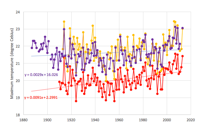
This reconstruction is shown by the purple line in Chart 1 (see below). It suggests a rate of warming less than half that shown in Cox’s global homogenised reconstruction; and might be better described as exhibiting considerable inter-annual variability – with cycles of cooling and warming.

The method used to develop this reconstruction perhaps represents an important first step in developing an Australian-wide reconstruction based on un-homogenised data.
Our chapter concludes that the series for southeast Australia is best described as showing statistically significant cooling (yes cooling) of 1.5 degree Celsius to 1949, followed by warming of nearly 2 degrees Celsius to the present. (If you would like a pdf copy of the chapter, email me: j.marohasy at climatelab.com.au).
The official Bureau of Meteorology reconstruction for the state of Victoria is shown in red in Chart 1; and is based on ACORN-SAT. The homogenised ACORN-SAT database only begins in 1910. It is used by the Bureau, and also CSIRO, to report climate variability and change. Eleven locations are used in the ACORN-SAT reconstruction for Victoria – with some of the series from these locations very short, and with a lot of missing data; all were remodolled.
Our southeast reconstruction is based on the same five long and continuous series with only three adjustments made to two of the series (Deniliquin and Cape Otway) to correct for equipment changes in 1908 and 1898 – as detailed in the chapter.
Despite the very different methodologies used, the reconstructions are surprisingly similar. Both reconstrucions show considerable inter-annual variability, with almost synchronous peaks and troughs: see Chart 1. In both reconstructions, 2007 is the hottest recent year, though temperatures were almost as hot back in 1914. In large part because the ACORN-SAT database only starts in 1910, which corresponds with a dip in the record, this official series for Victoria indicates an overall rate of warming of 0.9 degree Celsius per century – compared to 0.3 degree Celsius for the southeast reconstruction.
Both reconstructions are of maximum temperatures. Global warming is typically reported as an increase in the mean temperature, which is the average of the maximum and minimum temperatures. The maximum temperature is the daytime temperature; and an arguably better measure of regional temperature variation because of the higher rates of turbulent mixing of the atmosphere during the day time.
In Chart 1, I’ve also plotted temperature maxima as measured at the agricultural research station near Rutherglen in northern central Victoria – this is the series shown in yellow. This is an exceptionally high quality series because it has been measured using standard equipment at the same rural site for over 100 years. But it was not part of the southeast reconstruction because we only used series that began on, or before, 1887 for the southeast reconstruction.
Temperature minima and maxima do not always trend in the same direction. In the case of Rutherglen, temperature minima actually show cooling – consistent with other series from this region. This cooling is most obvious in spring, and probably associated with the extensive development of irrigation. Through the homogenisation process the Bureau change the cooling in the Rutherglen temperature minima to warming before including Rutherglen in the official ACORN-SAT database. I’ve written extensively about this, including in a recent research paper entitled simply ‘Temperature change at Rutherglen in south-east Australia’.
Key Reference/New book chapter
Marohasy, J. & Abbot, J. 2016. Southeast Australian Maximum Temperature Trends, 1887–2013: An Evidence-Based Reappraisal. In: Evidence-Based Climate Science (Second Edition), Pages 83-99. http://dx.doi.org/10.1016/B978-0-12-804588-6.00005-7


 Jennifer Marohasy BSc PhD is a critical thinker with expertise in the scientific method.

Groups of UFO believers also behave in similar fashion when they are shown some bit of evidence that affirms their belief.
https://www.youtube.com/watch?v=DL7bLpTSie8
Showing up a graph that shows no real information, which is all the climate apologist provides, is not really that different from what the UFO promoters do.
I could not say if maximum, minimum or average would be better. It depends a lot of what it could be used to and what it could tell of conditions for all kind of creatures and crops.
It reminds me again that any temperature average of any kind is a bad proxy for climate, even if it is the most used. Climate is so much more than just temperatures, and even more than some averages.
The climate science has put so much focus on average temperature, to prove a modest warming, that other more important parts of climate have been lost in the translation, and because of that climate is not understood well enough relative to the amount of money used.
Thank you Jennifer. First rate as always.
Have we reached the point where we can concentrate on modern figures only? The powers that be really have no opportunity to manipulate those numbers. Once they have proclaimed year x (2016 perhaps?) to be the ‘hottest ever’ they can hardly resile from that figure and reduce that temperature. It does give a short baseline but it is lengthening all the time. My guess is that the modern figures will tell a clear story – which will not be to the liking of the climate change industry. But, either way, they will provide solid evidence.
The BoM claim an even larger rate of warming from the AWAP (supposedly “unajusted data”) than ACORN for Australia from 1910. Do we know if they are using the daily or often contradictory monthly AWAP?
http://www.bom.gov.au/climate/change/acorn-sat/images/taf/fig7a-b.png
From
http://www.bom.gov.au/climate/change/acorn-sat/index.shtml#tabs=FAQs
For those who may ask why I say the montly AWAP contradicts the daily, the long story is here.
Good work Jennifer, its pretty explosive stuff.
As conspiracies go, this is huge, adjustments are being carried out on a universal scale.
https://notalotofpeopleknowthat.wordpress.com/2015/01/20/massive-tampering-with-temperatures-in-south-america/
The CSIR’s Meteorological Data for Certain Australian Locations (http://www.waclimate.net/csir.pdf), published in 1933, provides totally raw min and max for hundreds of sites from their first ever recording till 1931.
Melbourne min/max
<1931 – 9.8C / 19.6C
2000-15 – 11.9C / 21.0C
Echuca min/max
<1931 – 9.6C / 22.3C
2000-15 – 9.0C / 23.1C
Deniliquin min/max
<1931 – 9.8C / 23.4C
2000-15 – 9.5C / 23.7C
Cape Otway min/max
<1931 – 10.4C / 17.8C
2000-15 – 11.3C / 17.2C
Wilson's Promontory min/max
<1931 – 10.8C / 16.5C
2000-15 – 12.3C / 17.0C
Rutherglen min/max
<1931 – 8.3C / 22.9C
2000-15 – 7.3C / 22.5C
Melbourne/Echuca/Deniliquin/Cape Otway/Wilson's Promontory
<1931 average min – 10.1C
2000-15 average min – 10.8C
<1931 average max – 19.9C
2000-15 average max – 20.4C
<1931 average mean – 15.0C
2000-15 average mean – 15.6C
Melbourne/Echuca/Deniliquin/Cape Otway/Wilson's Promontory/Rutherglen
<1931 average min – 9.8C
2000-15 average min – 10.2C
<1931 average max – 20.4C
2000-15 average max – 20.7C
<1931 average mean – 15.1C
2000-15 average mean – 15.5C
Melbourne has significant UHI artificial warming in raw, so is a poor inclusion …
Echuca/Deniliquin/Cape Otway/Wilson's Promontory
<1931 average min – 10.1C
2000-15 average min – 10.5C
<1931 average max – 20.0C
2000-15 average max – 20.3C
<1931 average mean – 15.1C
2000-15 average mean – 15.4C
If I toss Rutherglen into the regional mix …
Echuca/Deniliquin/Cape Otway/Wilson's Promontory/Rutherglen
<1931 average min – 9.8C
2000-15 average min – 9.9C
<1931 average max – 20.6C
2000-15 average max – 20.7C
<1931 average mean – 15.2C
2000-15 average mean – 15.3C
Rutherglen alone …
<1931 average min – 8.3C
2000-15 average min – 7.3C
<1931 average max – 22.9C
2000-15 average max – 22.5C
<1931 average mean – 15.6C
2000-15 average mean – 14.9C
A couple of years ago I compared the CSIR <1931 temps in Victoria and all other states (as well as 1911-40 temps derived from the 1954 Year Book) … http://www.waclimate.net/year-book-csir.html
The mean temp of 34 Victorian stations <1931 (including Melbourne) was 14.3C compared to their collective long-term averaged mean of 14.3C and their 2000-14 averaged mean of 14.6C.
Among 226 stations across Australia including all capitals, the mean temp increased 0.46C from <1931 to 2000-14.
A fair number of the <1931 CSIR temps were recorded in the 1800s in various pre-Stevenson screens with little quality control, but they also were only mildly affected in those years, if at all, by UHI which is an artificial influence in both major cities and regional towns.
Using the CSIR as an alternative raw data source compared to 2000-14, and including minima to calculate means, there is agreement on 0.3C as the actual raw temperature increase at both Echuca/Deniliquin/Cape Otway/Wilson's Promontory/Rutherglen and at 34 weather stations across Victoria.
Include a 0.1C mean temperature increase from the 1972 metric change to Celsius (acknowledged by the BoM – see ACORN technical report), and the raw increase is about 0.2C.