IN the very first report from the United Nation’s Intergovernmental Panel on Climate Change (IPCC) the Medieval Warm Period was evident as a period, about as warm as the present, occurring from AD 950 to 1250. In subsequent IPCC reports there is no such warm period in this historical record. Instead there is a graph, shaped like an ice-hockey stick, which suggests temperatures were flat until the 20th Century, when sudden and sustained warming occurs.

The change, from the presence of a clear warm period about 1000 years ago to none at all in more recent reports, is justified by the IPCC on the basis that while it may have been warmer in Europe when the Vikings founded settlements on Greenland, and England was exporting wine to France, this warming was not global. The warming, according to the IPCC, was restricted to the North Atlantic region. Which begs the question, how important is regional variability when we are discussing global warming?
Furthermore, no-one lives in a world climate. It’s what happens locally and regionally that is most important to individual communities. We should expect that an El Nino event in the Pacific Ocean, for example, is going to affect the western United States very differently from eastern Australia. Indeed, such events are often associated with wetter conditions in southwest USA, and hotter, drier conditions in eastern Australia.
The focus on mean global temperatures, rather than regional variability, has been a consequence of the politicization of climate science and the desire to use the authority of science to force political change. Many of those opposed to this political agenda, often labelled sceptics or deniers, have focused on temperature series that show little or no global warming, while the mainstream climate science community has gone to ever more extreme lengths to make particular temperature time series conform to their theory of anthropogenic global warming.
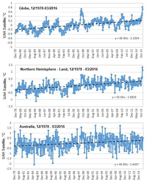
Some so-called sceptics had been focusing on the satellite record over recent years, because that component of this record based on the mean global temperature, showed no increase since the El Nino event of 1997/98, Chart 1a. However, more recently, and largely as a consequence of the relatively warm and wet winter in the northern hemisphere, there has been another spike in the global mean temperature based on this satellite record.
This signifies the end of “the pause” in the mean global temperature for the UAH satellite record. Though, interestingly, some have simply changed their geographic focus, much as the IPCC did with the Medieval Warm Period. In particular, some so-called sceptics now emphasis the geographic variability in the satellite record, in particular, that southern hemisphere temperatures showing no recent spike.

The satellite record as compiled by scientists John Christy and Roy Spencer, at the University of Alabama (UAH), Huntsville, includes monthly updates for the entire globe, for the northern and southern hemispheres, the south and north poles, the tropics, the United States of America, and also for Australia. The UAH satellite record also separates out ‘land’ and ‘ocean’. So, for the northern hemisphere, as an example, it is possible to understand temperature trends for the land versus ocean components of this record. When we consider the land component of the UAH satellite record for the northern hemisphere, the recent spike in temperatures is particularly pronounced, Chart 1b. Meanwhile, for Australia, there is no such recent spike in temperatures. Rather temperatures appear to cycle within an approximate 4 degree Celsius band, Chart 1c.
Patterns in the historical temperature record, and geographic variability in temperature trends, potentially gives us insight into the drivers of climate change. Many, however, would argue that as the satellite temperature record only goes back 38 years to 1978, that this is too short a period for discerning correlations with sunspots, and other extraterrestrial phenomena. In fact, consistency between the UAH satellite record for Australia, and records from individual weather station in Australia over this same period (December 1978 – March 2016), potentially gives us the opportunity to infer what temperatures would have been like at least back to when these weather stations were first installed. There is, for example, a reliable thermometer temperature record for Richmond in north eastern Australia back to 1893. Considering just the trends, not the absolute temperatures, the thermometer record for this location shows a remarkably good correlation with the satellite record for all of Australia for the period December 1978 to March 2016, Chart 2.
![The monthly thermometer record for Richmond, NE Australia, compared with the UAH satellite record for all of Australia. [Note, chart 1 was a plot of anomalies, this is a plot of actual temperatures.]](http://jennifermarohasy.com/wp-content/uploads/2016/04/UAH-Richmond-Monthly-toMarch2016.gif)
The pattern in the unadjusted thermometer record for Richmond, and the shorter satellite records for all of Australia, the northern hemisphere and the globe, are not consistent with carbon dioxide as a significant driver of temperature change.
Additional Information:
For more information on the UAH satellite record compared with other global data bases consider reading a recent post by Bob Tisdale at WUWT: https://wattsupwiththat.com/2016/03/12/february-2016-global-surface-landocean-and-lower-troposphere-temperature-anomaly-update/
For more information on the temperature record for Richmond, and why this unadjusted series is so unique and important consider reading a recent post focused on Darwin, but also considering other sites in northern Australia, here: http://jennifermarohasy.com/2016/02/12910/
I have commented in more detail on the ‘end of the pause’ and the likely reason for the recent surge in the global mean temperature, as measured by satellites, in a recent popular article at On Line Opinion here: http://www.onlineopinion.com.au/view.asp?article=18111


 Jennifer Marohasy BSc PhD is a critical thinker with expertise in the scientific method.

The MWP was global, another rebuttal of the egregious ‘science’ put forward by the IPCC and other alarmists:
http://www.co2science.org/data/mwp/mwpp.php
Homogenisation removes regional variability and loses the many micro-climates which actually do exist outside of statistics.
Some years ago my friend Harry Black, who led many expeditions to the Himalayas and Macquarie Island, settled on a small property on the south coast of NSW. He chose the site because the micro-climate allowed him to grow tropical and sub-tropical fruits.
In a homoginised climate model Harry’s property would not exist.
John, and how about all those well chosen micro-climates where the BoM love to keep their thermometers?
When it’s all boiled down, temps all around the globe are little more than of academic interest to all of us.
At any given time, we already know that if it’s 30C where we currently are, folk in other places will be experiencing 0C, and 6 months later, those experiences will be reversed.
The more things change .. .. .. ..
“This signifies the end of “the pause” in the mean global temperature for the UAH satellite record.”
The issue has never been about an actual pause or hiatus in global temperature but rather the disparity between projected & measured rate of temperature increase. The satellite record continues to show the disparity. This is clear evidence that the CAGW theory is false. Regrettably, climate scientists would rather claim there is something wrong with the data (i.e reality) & try to manipulate (homogenize) the data than give up on a failed pet theory.
Great post as usual Jen. One of my pet topics is the federation drought and how the BOM deceive people by excluding it from their (adjusted) long term temperature series, starting all the graphs after 1905.
Your posts show the existence of continuous records back into the late 1800’s for places like Richmond Qld, backed up by published maximum temperatures in the newspapers of the day. These records must give the lie to the adjusted Acorn-Sat series, which have their early temperatures adjusted down by as much as 1.5 deg C vs the unadjusted data.
Continuous records like Richmond and also Darwin, Burketown and Palmerville must be the death knell for the Acorn-Sat adjustments.
Great post, Jen. My immediate comment is that I would prefer to see the three charts in Chart 1 at the same scale on the y-axis – makes comparisons that much easier.
High John Singer . Same scenario for the Heathcote Valley in Christchurch NZ.
Nice, sunny winter mornings , while the Airport , etc shivers in the fog and frost.
Perfect for growing delicate plants.
Very difficult to see for climertolergists and their computers, but clear as a bell to the primitive eyeball.
Ken Stewart finds that UAH V 6 south polar region shows a pause since Dec 1978. Also the South extra tropics region shows a pause for over twenty years or more than half the Sat record. So much for their CAGW. Those two regions make up a large area of the planet’s surface.
https://kenskingdom.wordpress.com/2016/04/17/antarctic-trends/#comments
Steve McIntyre goes after NASA’s Gavin Schmidt’s trickery. This should be very interesting.
https://climateaudit.org/2016/04/19/gavin-schmidt-and-reference-period-trickery/#more-21871
Ken Stewart’s latest UAH March update still shows a pause in all the regions except the Nth extra tropics.
Her are the Globe and regions.
Globe a pause for 18 yrs 10 months, over half the record.
NH a pause for 18 yrs 4 months.
SH a pause for 20 years 9mths, over half the record.
Tropics a pause for 21 yrs 6 mths , well over half the record.
Trop oceans a puse for 22 yrs 4 mths ‘ as above.
Nth ex tropics no pause, but trend of just 0.13 C per century, so no Stat significant warming at all.
Sth ex tropics a pause for 20 yrs 7 mths. Over half record.
Nth polar a pause for 14 yrs 1 month.
S polar a pause or slight cooling since Dec 1978.
USA a pause for 18 yrs 10 months.
OZ a pause for 21 yrs 1 mth , over half the record.
Of course there is a longer lag with Sat temps, so the pause could disappear in the coming months. But if a la nina returns later this year the pause may come back after that date.
So far not much to show in all the globe’s regions since 1997.
Sorry, here’s the link for the above.
https://kenskingdom.wordpress.com/2016/04/08/the-pause-update-march-2016-complete/
The pause may or may not be over- we will see when the current El Nino dissipates.
That said, your larger point about global climate constructs vs. regional realities is very important.
Here in Houston, Texas we are experiencing local impacts from the El Nino that are quite dramatic.
Thanks for a great post.
Dear Ms. Marahosy.
Regarding your concerns over homogenisation and elimination of old data sets, I have the following remarks:
Two good reasons why old data is discarded:
[1] Your first photograph of Darwin Post Office (linked article), purportedly taken in 1890, clearly shows the thermometer screen was in a different location and of a different design to the one in the other two photographs. It is therefore not valid to compare temperatures from both instrument shelters at different times (pre 1910 versus post 1910) without a having measured temperatures from both screens in the same places over the same period.
[2] Old screens evidently produced higher daytime temperature readings. Refer for example to:
Orange Leader newspaper Monday April 21st 1913:
“MOLONG POST OFFICE.
The Molong post office has just been fltted with a new Stevenson weather screen of the very latest pattern, fitted with maximum and minimum thermometers. With the new Instruments, a week’s observation shows a difference of 1 ½ deg. maximum, and 1 deg. in the minimum proving that the old pattern of screen and thermometer were unreliable to a certain extent. The office has also been provided with a new rain gauge and proper receptacle. Both these appliances were set with a spirit level and compass, so there should be no doubt as to their accuracy of registration.”
Sydney Morning Herald Saturday 13th January 1906:
“MONARO CLIMATE.
TO THE EDITOR OF THE HERALD.
Sir, In reply to a letter on above subject in to-day’s “Herald” by “Veritas,” I should like to state that the screen in which the thermometers are placed at Cooma is known as the “Greenwlch” pattern. Although it does not afford the best possible exposure, it is considered satisfactory. The “Stevenson” screen is now generally admitted as affording the best shade for thermometers, and we are now supplying these to country stations as far as the funds at our disposal will allow. I am, etc., H. A. HUNT, Jan 12. Acting Meteorologist.
The letter to the editor stated on January 12th 1906:
“… Your correspondent suggests that perhaps the fact of the thermometer registering so high in summer is due to the post-office, where it presumably hangs, being surrounded by pine trees, but if this were the case, surely in the winter their shelter would prevent its registering so many degrees of frost. Instead of, as now, more than at any other place I think it is more likely that it is not hanging in the proper shade, and is perhaps under an iron roof, which would easily account for extremes of both both and cold, and consequently for the misleading reports which have long been appearing.””
The adjustment of Darwin Post Office data to be comparable to Darwin Airport is entirely reasonable (though not ideal) because the instrument shelter design is the same (eliminating one variable), and it is only the location that differs. The average maximum from 1910 to 1941 at the Post Office should not differ greatly for the 30 year average maximum (1942 to 1971) at the Airport – they are only 12km apart. Any difference is most likely attributable to the site over this short period. The airport is obviously a cooler site than the post office was, hence the fiddling of the post office data. The cool temperatures 1939 to 1941, if not due to shading, would have to be researched.