I’m back in Yeppoon. This afternoon I was at Wreck Point, and in the distance, over my left shoulder, you can see Great Keppel Island. According to the New York Times there is mass coral bleaching there (CLICK HERE). A photograph of the corals at Monkey Beach reef featured in an article in that newspaper just yesterday. It was apparently taken on March 5, 2024.
(I’m hoping to see these corals for myself this weekend. To be sure to know what I find out, to be sure to see the photographs I’m hoping to take, consider subscribing for my free email updates (CLICK HERE).)
The New York Times attributes the bleaching to extraordinarily warm ocean temperatures. Of course, there is no chart, no data – no information on actual ocean temperatures.
It is exceedingly rare for any newspaper to ever publish location specific temperature data. In fact, that is the only real type of temperature data: location specific data. Everything else is a construct – a contrived statistic.
The picture of the bleached corals at Great Keppel Island, published in the New York Times, was apparently provided by AIMS (Australian Institute of Marine Sciences). Of course, they also have temperature data. One of their key weather stations is at Square Rocks just to the northwest of Great Keppel Island. There is data for the period December 19, 2009, through to February 19, 2024. This data, consistent with the information I have previously published for the central region does not suggest that ocean temperatures have been particularly warm this last summer.
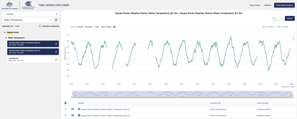
(There is very little difference in the two temperature profiles at the different depths so there is much overlap in the above chart. For clarity I will also now post these times series separately.


There is sea level data for Rosslyn Bay, just across a little further to the east from Great Keppel Island. (I will be catching the ferry to Great Keppel Island from Rosslyn Bay marina at the end of the week, weather permitting and passing Square Rock.)
This sea level data indicates monthly averages are towards the low end of their annual cycle, and have stalled. This is consistent with an El Nino event and the water sloshing over to the other side of the Pacific Ocean, you can read more about the phenomenon at the NOAA website (CLICK HERE).
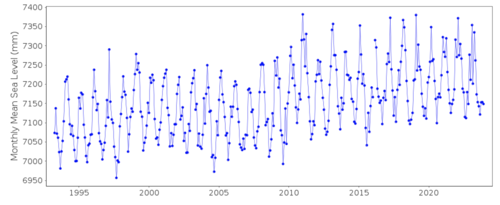
Could it be that the bleaching at Great Keppel Island has more to do with lower-than-average sea levels for this time of year, rather than unusually warm water? I’m just asking the question. (It is perhaps better to have questions that cannot be answered, rather than answers that cannot be questioned.)
Square Rock also has air temperature data, and, of course, the two move somewhat in unison except that the air is consistently a little cooler. This is the air that has all the greenhouse gases, that is meant to be warming the ocean.
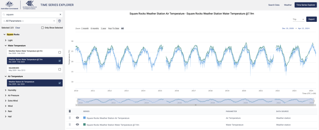
Of course, only someone who believes the nonsense from the experts and who can’t read a chart could believe that the air warms the ocean!
The sun warms the ocean that warms the atmosphere. That is what happens in the tropics at least, which is where I live.

MORE INFORMATION. UPDATE 17TH APRIL 2024


 Jennifer Marohasy BSc PhD is a critical thinker with expertise in the scientific method.

The BBC are also at it.
https://www.bbc.co.uk/news/science-environment-68814016
… “these data”…
Good on you.
Colder than usual is quite possible of course and rarely mentioned.
So is heavy, rapid rainfall/freshwater dilution of seawater during low tides.
And a combination of both of course.
You again mislead readers!
You say, “This data, consistent with the information I have previously published for the central region does not suggest that ocean temperatures have been particularly warm this last summer.”
You’re either blatantly lying or not very good with data. I sincerely (and genuinely) think it’s the latter.
At your chosen site, the ONLY summer data available for 2024 is between 1st Feb to the 15th Feb and for that period, compared to other years …
Year Average Anom degrees below 2024
2010 27.26 2.26
2011 27.71 1.81
2012 28.07 1.45
2013 27.40 2.12
2015 27.44 2.08
2016 27.87 1.65
2017 28.49 1.02
2018 26.88 2.64
2019 27.24 2.27
2020 28.80 0.71
2021 27.53 1.99
2022 27.37 2.15
2023 27.68 1.84
2024 29.52
The AIMS data that you cite is available here.
https://apps.aims.gov.au/ts-explorer/?source=78:Weather%20station&fromDate=2009-12-19T00:00:00&thruDate=2024-02-19T00:00:00
******
Thanks Brendon. The link that you provide shows the extent of the available data consistent with what I have posted.
This water temperature data, from December 2009 until March 2024, is incomplete, including for some of this last summer. There is a more complete time series for air temperatures that I also posted.
I am nevertheless confident that these series have caught the peak of last summer’s warm cycle, and that the charts indicate that this last summer has not been particularly warm contrary to media reports – at least at Great Keppel Island considering this location specific AIMS air and water temperature data.
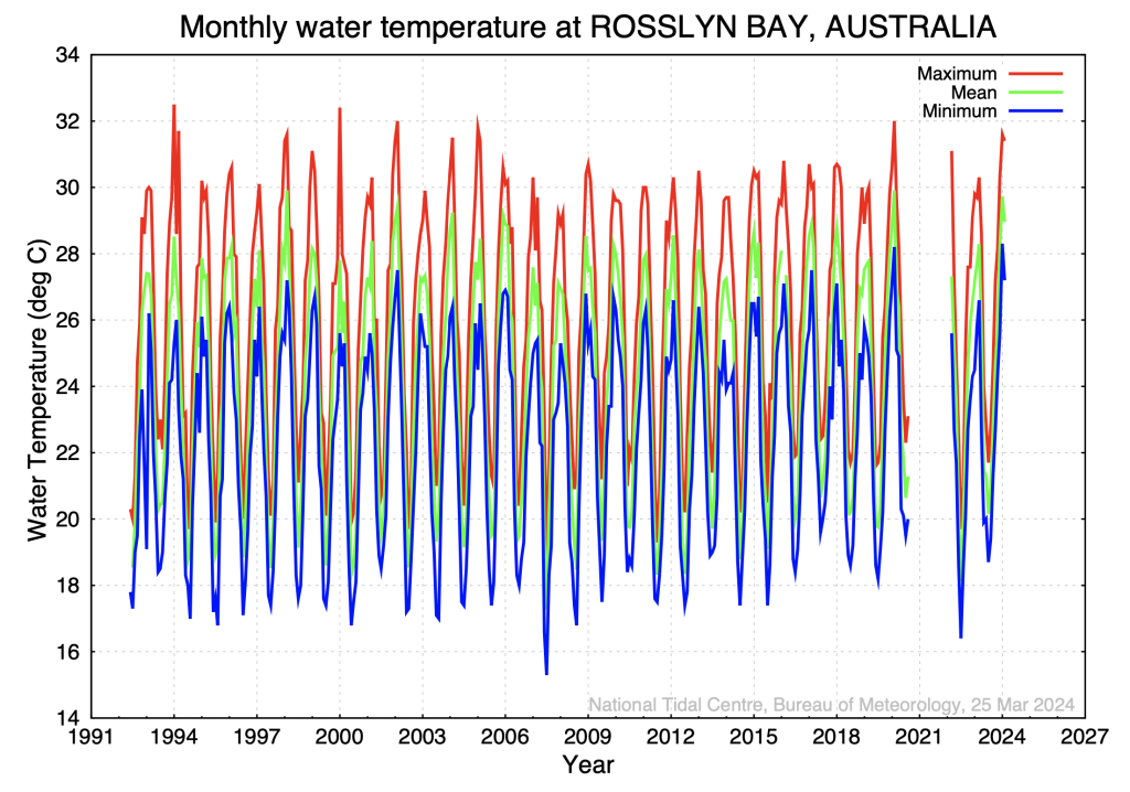
I’ve also looked around for more information, and today found water temperature data for Rosslyn Bay, that is just across from Great Keppel Island. This time series that is collected by the Australian Baseline Sea Level Monitoring Project is twice as long, beginning in 1991, and complete for this last summer. The chart has been added as a postscript to the above blog post. The data is available here: http://www.bom.gov.au/oceanography/projects/abslmp/data/monthly.shtml
Consistent with the Square Rock time series for both water depths, and also air temperature, this data for Rosslyn Bay indicates that there have been hotter summers and that water temperatures follow distinct seasonal cycles. There is no global warming evident in this time series.
Cheers, Jennifer Marohasy
Apparently even NASA are part of the conspiracy.
https://climatekids.nasa.gov/ocean/
Jen, thank you for drawing my attention to Square Rocks Weather Station Water Temperature @2.9m.
30.41 degrees on February 6 is quite warm wouldn’t you agree? Warm enough to cause coral bleaching?
https://i.postimg.cc/8cS3vFPY/Screenshot-2024-04-17-174708.jpg
https://apps.aims.gov.au/ts-explorer/?source=78:Weather%20station&fromDate=2024-01-01T00:00:00&thruDate=2024-02-18T00:00:00&fbclid=IwAR1HR6r7tTfSCV54m6651jzI1i_yrysqjIz8oj_g_FTIk6buMnGpL3ii8Mk_aem_Afs1gyuReH0NmtY6JFN3yyDQRqTnspczLTdybZ0P6btQQ5MzK4tGRuYMvptyqE0MX3AsuuIdDjsrMmMXmjwZLex1
Continuing with your interest in Square Rocks water temperatures. Please find the Square Rocks Weather Station Water Temperature @2.9m weekly average graph for weeks beginning around the end of February 2010-2024.
https://i.postimg.cc/vm77ZMmQ/Screenshot-2024-04-17-184011.jpg
Jen, thak you for drawing my attention to Rossly Bay. Please find appended Mean monthly sea levels for Rossly Bay.
https://i.postimg.cc/XqFRDp8f/Screenshot-2024-04-17-190745.jpg
Thanks Kevin. The coral across the bay bleach quite regularly and recover. This can be caused by fresh water runoff and also higher temperatures, even colder temperatures.
This last week it has been relentless on the news, with specific mention of Great Keppel Island, that there is a marine heatwave, that is causing unprecedented coral bleaching.
I can’t find the marine heatwave in the data, not even your interpretation of it.
And the other issue is the claim that this is caused by greenhouse gases, that have made the atmosphere so warm it is heating the ocean. Don’t you find this rather bizarre, and especially given the chart that I show with the air and water temperatures together?
Cheers,
Oh Dear Jennifer,
https://i.postimg.cc/DmkzNF7X/Rosslyn-Bay.png
Rosslyn Bay Jan/Feb Temperature data shows a clear upward trend. If you pick any month and compare it to previous years, they too show an upward trend.
Year Avg Water Temp
1993 27.4
1994 27.9
1995 27.6
1996 28.0
1997 27.2
1998 28.8
1999 28.1
2000 26.7
2001 27.2
2002 29.2
2003 27.2
2004 28.9
2005 27.8
2006 28.9
2007 27.0
2008 26.9
2009 27.5
2010 27.7
2011 27.9
2012 27.9
2013 27.7
2014 26.9
2015 28.0
2016 28.3
2017 28.7
2018 28.4
2019 27.6
2020 29.4
2021
2022
2023 27.4
2024 29.4
WOW.
You blocked me on facebook for pointing out you were wrong again.
Can’t handle the truth?
Jen, “I can’t find the marine heatwave in the data, not even your interpretation of it.”
I’m not interpreting the data, just reporting data from the same sources you use. I then apply the default Excel linear trend line to highlight the obvious rising trend.
The world is ending; but don’t worry Brendon and Kevin, the climate hysterics are on the job. They’ve established the GBR has melted now they can apply their great stat and graphing skills to the Pacific Islands; start with that well known hot spot Tuvalu chaps: off you go:
http://www.bom.gov.au/pacific/projects/pslm/index.shtml
Thank you for the link cohenite, I assume you were directing me to the Pacific Sea Level and Geodetic Monitoring Project which shows steadily increasing sea levels around Tonga.
https://i.postimg.cc/HnMNmx00/Screenshot-2024-04-19-180416.jpg
Thanks Kev; what’s the sea temp around Tonga doing during it’s land subsidence; that is, the ocean isn’t rising but the land is sinking. Carry on.
cohenite, you could plot all of the Pacific island data and add a trend line.
Or you might like to read this peer reviewed analysis…
https://www.sciencedirect.com/science/article/pii/S0012825214000956
Yeah, thanks Kev, I’ve seen the paper. It confirms PDO. But I thought you were concerned with OHC; so why are you on about sea level rise which, as I say, is consistent with PDO and has nothing to do with the utter BS of AGW.
It’s all connected. Scientists refer to it as climate change. You should read up on it. After months of denial, Jen has finally dived on a reef and now understands the gravity of the situation. A situation that researchers have been warning of for some time.
“Results indicate a 62-year warming of 0.43 ± 0.08 W m−2, and a statistically significant acceleration rate equal to 0.15 ± 0.04 W m−2 dec−1, locally peaking at high latitudes. The 11.6% of the global ocean area reaches the maximum yearly OHC in 2022, almost doubling any previous year.”
https://www.nature.com/articles/s41467-024-44749-7
“It’s all connected.”
Yep, it’s the great web of life: greenies, grifters and assorted useful idiots are all over it.
“Scientists refer to it as climate change.”
I could be wrong but I believe 97% of all scientists are true believers.
You still haven’t looked at the non-existent OHC increase around the Pacific islands. Is the warming only affecting the GBR? Maybe it’s all the bloody scientists up there looking for bleaching and warming.
Actually the climate today is as good as this planet can offer. A bit more CO2 in the atmosphere would be good though; you know so the poor trees can photosynthesize better. I’m sure you agree since you appear to be a tree hugger, sorry, lover.
Scientists don’t believe, they measure, analyse, think… Concepts beyond deniers like cohenite. I’m proud to be part of the 97 percent.
“I’m proud to be part of the 97 percent.”
Is that IQ?
But seriously, John Cook’s 97% paper is an absolute load of junk:
https://iopscience.iop.org/article/10.1088/1748-9326/8/2/024024
I’ll explain why kev.
The first 2 categories of Table 2 in the paper are:
1. Explicit endorsement with quantification. Explicitly states that humans are the primary cause of recent global warming. The global warming during the 20th century is caused mainly by increasing greenhouse gas concentration especially since the late 1980s’.
2. Explicit endorsement without quantification. Explicitly states humans are causing global warming or refers to anthropogenic global warming/climate change as a known fact. Emissions of a broad range of greenhouse gases of varying lifetimes contribute to global climate change.
Now I would think that category 1 is a more definitive support of AGW since it is based on quantification, which I gather to mean statistical proof whereas category 2 has explicit support without such proof.
Strangely however category 6 is a stronger rejection of AGW then category 7 which is why I compared it with category 1 which appears to be the strongest support. Category 6 states:
(6) Explicit rejection without quantification. Explicitly minimizes or rejects that humans are causing global warming’…the global temperature record provides little support for the catastrophic view of the greenhouse effect.
Category 7: (7) Explicit rejection with quantification. Explicitly states that humans are causing less than half of global warming. The human contribution to the CO2 content in the atmosphere and the increase in temperature is negligible in comparison with other sources of carbon dioxide emission.
Category 7 requires quantification it is true but that quantification still allows for AGW to cause 50% of global warming whereas category 6 rejects AGW 100%. The rest of the categories are also as interchangeable. The point is who and by what criteria made the allocation of the Abstracts into the respective categories. These scientists whose papers were put into categories strongly reject that categorisation:
In Cook’s paper he defines the consensus position as being:
“That humans are causing global warming.”
That consensus position is defined in Cook’s categories by category 1 of Table 2 which I have already quoted. The rest of your categories reflect varying degrees of lessor support for AGW [categories 2 and 3], or indifference to AGW [categories 4a and 4b] or active opposition to AGW [categories 5 to 7].
Only the first 3 categories could be defined as giving support for AGW. However, on the basis of the categories 1-3, of the original 11944 Abstracts from papers on climate selected the paper DISCARDED 8048 papers or 67.4% because they had no position.
Of the remaining 4014 papers or 32.6% of papers 3973 or 99% of the remaining abstracts fell into categories 2 and 3. Only 41 or 1% expressed support for Cook’s definition of the expressed support for Cook’s definition of the consensus that: “Humans are causing global warming.”
That’s 1% not 97%.
Now Cook says he had the authors of the papers rate their papers according to his criteria; Cook said: “1200 scientists rated their own papers, resulting in over 2000 papers being categorised by the papers’ own authors. Among papers that were self-rated as stating a position on human-caused global warming, 97.2% endorsed the consensus.”
The author’s self-rating is shown by Table 4 from Cook’s paper. In fact 2142 papers received self-ratings from 1189 authors. Cook’s paper says of those 2142 self-ratings 1342 are described as Endorsing AGW. That is confirming the consensus position or category 1 of Cook’s 7 categories. The caption to Table 4 says: “Self-rated papers that endorse AGW have an average endorsement rating less than 4.” But that would include categories 2 and 3 which are LESS than the consensus position. So the question remains exactly how many self-rated Abstracts actually conform to Cook’s definition of the consensus as defined only in category 1.
In addition, the self-referencing shows that 761 scientists have no position on AGW which as the caption to Table 4 says conforms to categories 4a and 4b of Cook’s categories which is 761/2142 X 100 = 35.52%. That is much less than Cook’s paper’s initial selection and discard of 67.4% of the 11,944 papers because the Abstract had no position on AGW. Maybe the only scientists who responded to the invitation to self-rate were those who initially had a position on AGW. If so 35.52% of them changed their minds from being in categories 1-3 to being in categories 4a and 4b!
Any way you look at this the % actually supporting the consensus, as defined in your paper, is less than the claimed 97%.
What do you think kev since you’re one of the 97%?
Here you go Con…
Greater than 99% consensus on human caused climate change in the peer-reviewed scientific literature
Mark Lynas, Benjamin Z Houlton, Simon Perry
Environmental Research Letters 16 (11), 114005, 2021
While controls over the Earth’s climate system have undergone rigorous hypothesis-testing since the 1800s, questions over the scientific consensus of the role of human activities in modern climate change continue to arise in public settings. We update previous efforts to quantify the scientific consensus on climate change by searching the recent literature for papers sceptical of anthropogenic-caused global warming. From a dataset of 88125 climate-related papers published since 2012, when this question was last addressed comprehensively, we examine a randomized subset of 3000 such publications. We also use a second sample-weighted approach that was specifically biased with keywords to help identify any sceptical peer-reviewed papers in the whole dataset. We identify four sceptical papers out of the sub-set of 3000, as evidenced by abstracts that were rated as implicitly or explicitly sceptical of human-caused global warming. In our sample utilizing pre-identified sceptical keywords we found 28 papers that were implicitly or explicitly sceptical. We conclude with high statistical confidence that the scientific consensus on human-caused contemporary climate change—expressed as a proportion of the total publications—exceeds 99% in the peer reviewed scientific literature.
“scientific consensus” – Too funny!
Consensus will always be obtained when the only funding available is for those prepared to endorse the consensus.
Now you’re suggesting science is done by surveys and a show of hands.
There was 100% consensus that stomach alcers were caused by stress. Every doctor, ever scientific body, every scientist will ‘agreed’ this was the case. It took an Australian physician by the name of Barry Marshall to prove them all wrong.
When you can’t get funding to look into an alternative view, you’ll always end up with a result that’s not worth the paper it’s written on. This is why there is such a replication crisis in science today with as much as 90% of the papers being totally wrong.
“Greater than 99% consensus on human caused climate change in the peer-reviewed scientific literature
Mark Lynas, Benjamin Z Houlton, Simon Perry
Environmental Research Letters 16 (11), 114005, 2021”
This is the mob who tried to tidy up the Cook debacle. This Lynas debacle was eviscerated here:
https://www.mdpi.com/2225-1154/11/11/215
Kev is a bit exhausted no doubt so here is a synopsis of the rebuttal of Lynas consensus garbage:
https://notrickszone.com/2023/11/30/new-study-68-of-scientific-papers-can-be-said-to-reject-the-agw-hypothesis/
Kev, I know nothing will change your mind (sic) but can you do better with your links then this drivel.
Con, here’s an update, there’s some big words so take your time.
More than coral: the unseen casualties of record-breaking heat on the Great Barrier Reef
24 April 2024
Extreme heat is threatening our coral reef ecosystems, writes Professor Emma Johnston and her co-authors about the damage they’re seeing on the Great Barrier Reef.
In past bleaching events on the Great Barrier Reef, the southern region has sometimes been spared worst of the bleaching. Not this time. This year’s intense underwater heat has triggered the most severe heat stress ever seen on record. Only 3% of surveyed southern reefs have not bleached at all. It’s shaping up to be the most severe and widespread bleaching of the southern reef, while mass bleaching has hit other areas of the reef in the fifth mass bleaching event in eight years.
https://www.sydney.edu.au/news-opinion/news/2024/04/24/the-unseen-casualties-of-record-breaking-heat-on-the-great-barrier-reef.html#:~:text=Only%203%25%20of%20surveyed%20southern,of%20stark%20white%20coral%20skeletons.
Kev, that’s a 30 second read; you’re still fixated on the effect not the cause: CO2 CANNOT heat the oceans; whatever is causing the bleaching isn’t anything to do with humans. Cause and effect kev; you’re all effect and no cause.
Good one Con, words, numbers, analysis, statistics are obviously well beyond your standard of education. Sit down.