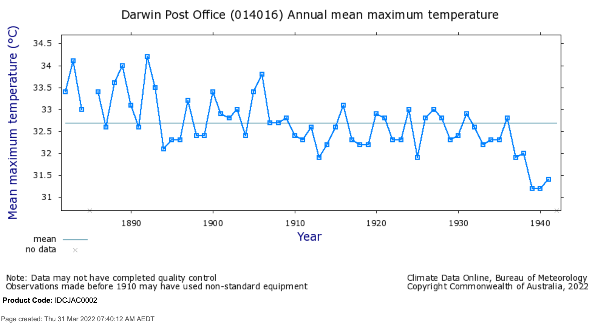
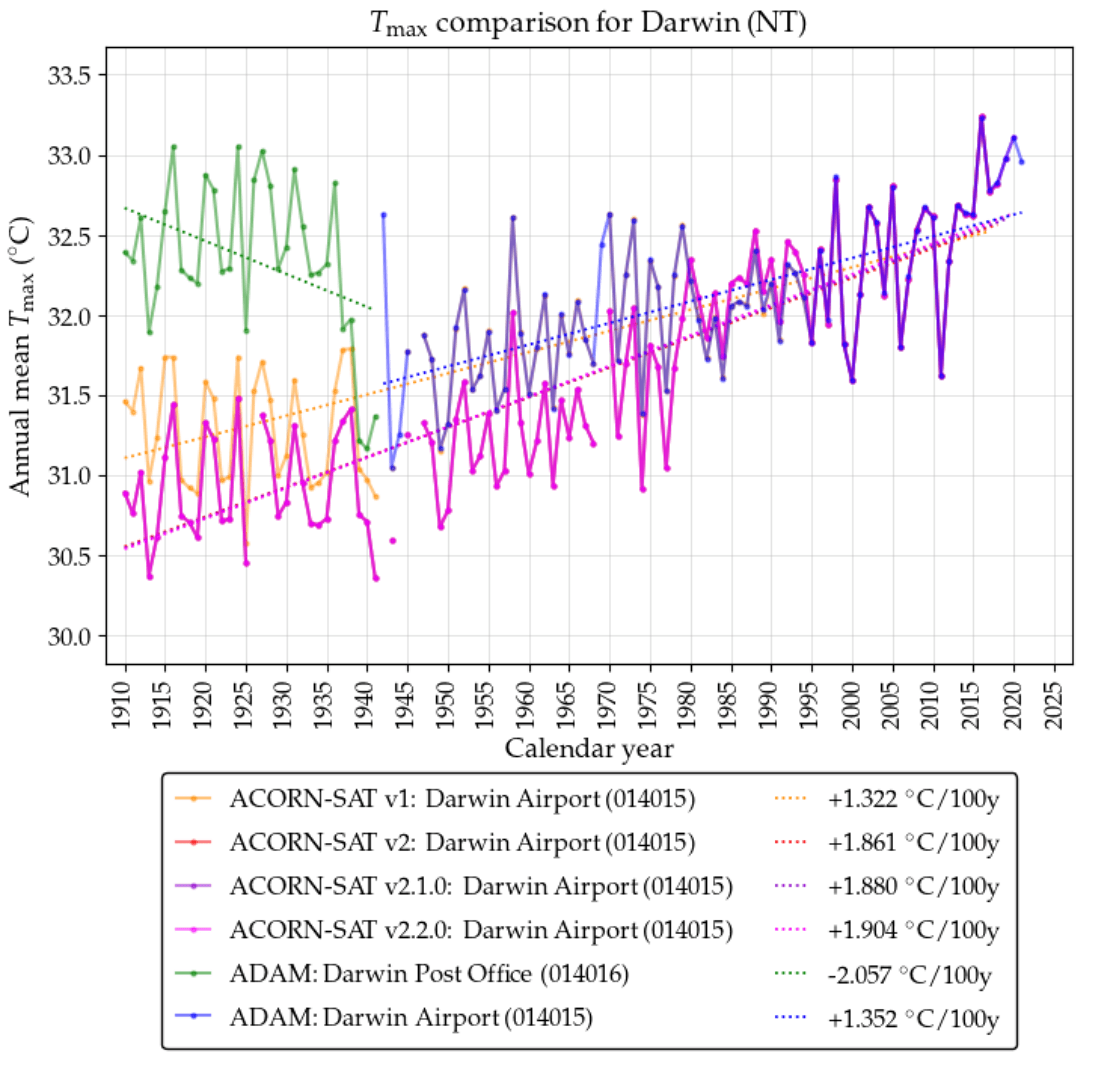
I can hardly be accused of cherry picking if I present all the temperature series – all four iterations of the homogenised ACORN-SAT temperature series charted with the raw historical series from the Australia Data Archive for Meteorology (ADAM). ADAM is a little-known data set that contains the unhomogenised values: the temperature values as they were recorded.
The extent of their remodelling is mind boggling, including for Darwin, where in the most recent iteration temperatures in the historical record are artificially cooled including for the period of World War 2.
Darwin was bombed 64 times by the Japanese during World War 2. The first air raid destroyed the weather station at the post office and killed the postmaster, but Darwin also had a weather station at the airport that had been in operation almost a year.
The Australian War Memorial would never change important historical war records, yet the Australian Bureau of Meteorology has remodelled Darwin’s temperature record dropping down maximum temperatures during World War 2 by on average 1°C for 1941 and on average 0.5 °C for 1942. The Bureau has done this by changing daily temperatures. For example, on 18th February 1942 – the day before the first air raid and the day of the last evacuation of civilians – the maximum temperature was recorded as 31.1 °C at the airport in the Australian Data Archive for Meteorology (ADAM). But when I look in the official Australian Climate Observations Reference Network – Surface Air Temperature (ACORN-SAT) database the maximum temperature for that day has been cooled to 30.1 °C. This revisionists approach to our climate history affects Australia’s war time record because weather and climate are critical to military strategy.
In March 2012, when Version 1 of ACORN-SAT was published, the Bureau was claiming in its catalogue that there was abnormal cooling of the Darwin temperature record before 1 January 1937 because of shading from trees. Somewhat peculiarly, this was then used as a justification for adjusting all the temperatures down before this date back to 1910, in effect further dramatically cooling the early record. At that time, there were no changes to the daily temperatures during WW2. The changes to the war record were made in 2018, in the development of ACORN-SAT version 2.0 and have been carried forward into the current version ACORN-SAT 2.2.
Just this month I’ve updated the interactive table at my website that shows the extent of the remodelling of the temperature record by plotting the annual maxima and minima series from each of the 112 homogenised ACORN-SAT sites (versions 1, 2.0, 2.1 and most recently 2.2) with the actual maxima and minima values from the Australian Data Archive for Meteorology (ADAM). There are 224 charts with at least five temperature series in each chart (more when the raw/ADAM data includes post office as well as airport series etc.). Click across and have a play:
https://jennifermarohasy.com/acorn-sat-v1-vs-v2/
There is a lot of work in those charts and this is the only place on the internet that you will find them!
The Darwin maximum temperature comparison is the feature image and does look a bit messy because initially temperatures were recorded at the post office (green series), and temperature were cooling following the cyclone in 1937. The Bureau have completely remodelled this cooling out of the official record with the latest iteration that is ACORN-SAT version 2.2 (pink series) showing gradual warming from 1910 through until the present. Considering the original series from the post office (014016 green) and then the airport (014015 blue) there is cooling and then warming.
It is the completely remodelled (pink series) not the original historic (green and then blue series) that are incorporated into the Annual Climate Statement to lament catastrophic human-caused global warming.
Homogenisation of the data is not the only factor that affects overall warming trends. The Bureau truncates the historical record to begin in 1910. Considering Darwin there is a perfectly good historical temperature record beginning in 1895 when temperatures were recorded using a mercury thermometer in a Stevenson Screen. There is no reason to truncate or change this record, but the Bureau completely remodels it removing the hot early record (pre-1910) and then dropping down/cooling daily values from 1980 until a linear trend is created (pink series).

*******
This is part 5 of the series ‘Australia’s Broken Temperature Record’. This blog post blew-out to 4,300 words in a draft that incorporated information about Darwin’s early war history and the story of the telegraphic office in Darwin that became the post office. The much longer version will be published as part of book that I am writing about how to fix Australia’s broken temperature record.


 Jennifer Marohasy BSc PhD is a critical thinker with expertise in the scientific method.

It seems to me, Winston Smith has been working extraordinary overtime for a purpose that defies any normal person’s wildest imagination.
I see the clowns at green piece are running another TV “SHOCK.! HORROR!! campaign.
They have a long history of political “science”. They were started as a soviet “useful idiot”, (anti nuclear and “environmentally concerned” front, many decades ago. See also the Brit “CND and many others globally. Given the way these things work, such organizations seem very capable of flitting from one “strong horse” sponsor to another, with all the attendant “spillage” one has come to expect.
This latest outstretched hand is predicated on the dreaded “Klimate Krisis” being directly responsible for wild-fires, rising seas, mega-floods, droughts, etc.
One of the latest is that “collapsing ice shelf in Antarctica.
An ice shelf is a relatively thin slab of ice that is projected out over water (Ocean). Basically a thin, wide glacier. And like all glaciers, it does not just magically do this; there is pressure from “uphill. Once the ice is out over the ocean, it melts, from underneath. As I recall my rudimentary physics, liquid water MUST be warmer than the ice that floats on it. Thus, the ice sheet MUST melt from underneath
Why is the water warmer? If it were colder, it would not be liquid water anymore. Apart from that, the circum-polar currents that haul nutrients for all those penguins, seals, whales, krill, etc that infest these waters, has input of warmer water from more temperate climes. And don’t forget the huge amount of geo-thermal energy released in Antarctica daily, both on and off-shore.
All of this “creative” science that we are supposed to believe, is bad enough. Then you “drill down”, to the GOALS of the vermin making these demands and it becomes clearer. ALWAYS! “Solutions in search of “problems”. ALWAYS!
Given the not-so-quietly expressed demand for “Population rediction”, were are looking at “FINAL SOLUTIONS” , as practiced widely in the 20th Century under several names.
Proof reading: the lost art.
Vision at eleven.
About the “population limiters”; It’s even carved in stone!
https://stolenhistory.org/articles/georgia-guidestones-maintain-humanity-under-500-000-000-in-perpetual-balance-with-nature.111/
Large scale and ongoing corruption at the BOM is a criminal activity and must be exposed in every way possible and the individuals involved must be named including their whereabouts.
Gidday Bruce,
Those guidestones are supposed to have been joint financed by Dr Billygates’ dad and the man from here, who invented myxo and got a Nobel for it.
Self spreading vaccine sound familiar ? The fact that some private outfit and CSIRO got “material” from biolabs in Ukraine and that DARPA is financing research into GM mice here, who will only breed female offspring is a bit relevant, too.
US Defence sees an real threat from our mice.
Someone is not on our side.
It looks like the UK Met is hiding the truth too:
https://www.conservativewoman.co.uk/the-climate-scaremongers-weather-records-shattered-180-years-ago/
Dear Jennifer,
The temperature record for Darwin is not straightforward. It is therefore reasonable to adjust for the effect of station moves and changes on compiled or joined datasets. An adjusted dataset is not the same as one that is ‘remodeled’. Anyway, the bigger question is whether adjustments truly account for changes in the signal over time, and whether the process is objective and replicable. At the heart of the issue is whether metadata faithfully reports on factors likely to impact on observations (which is unlikely).
The challenge is to differentiate between site changes that made no difference, while at the same time identifying changes in data that were potentially due to unreported changes. For Darwin, I first looked at this problem in February 2017 and although not yet published at https://www.bomwatch.com.au/, I updated that research in August 2020. In the interim I found additional information (maps, plans and photographs (including aerials) documents etc.) to corroborate my analysis. For instance, I found photographs that showed the original Stevenson screen was at the Telegraph Office in 1890. Another, (undated) shows the relocated screen at the Post Office, shaded by a large tree. A step-change in the data suggests the site moved in 1906.
A subsequent change in 1937 was due to a cyclone on 11 March that demolished the town and up-rooted most trees. Damage was extensive and widely reported in newspapers of the day, and of course the resulting change in temperature was not a climate-related trend. Simon Torok said that before 1941, the site moved (or data transitioned), probably to the Parap Aeradio office, which was operational in 1937. Construction of the new RAAF aerodrome adjacent to the Stuart Highway at Marrara, commonly known as ‘4-mile’ only commenced in 1939 and I don’t believe it was operational until 1941. After the cyclone and before it moved to Parap the screen must have been relocated somewhere else that was cooler, a garden or watered area perhaps (the step-change was negative 0.48oC). Simon Torok noted a ‘composite move’ in 1942, which is probably when data transitioned to the RAAF Aerado (or RAAF meteorological section) office at the 4-mile (todays current airport).
The essential problem is that, as all these scraps of data have been joined together as time series, any purported ‘trend’ is highly likely to be spurious. As for the current (Stuart Highway) airport, quoting from my half-finished interim report (21 May 2018):
“The ACORN-SAT catalogue (Bureau of Meteorology 2012a) suggests the Stevenson screen only moved once since records commenced in February 1941. However, aerial photographs from 1944, 1945, 1948, 1950, 1952 and 1960 show the original WWII Royal Australian Air Force (RAAF) Meteorological Section site (at about Latitude 12.4184o, Longitude 130.8724o) was 1.2 km west of the second (comparison) site (14040; Latitude 2.4227o Longitude 130.8844o), which moved 900 m east on 7 August 2001. The S2 and S3 sites are visible in a Google Earth Pro satellite image (31 August 2005). So, there is an undocumented move, possibly corresponding with installation of wind-finding WF44 and METOX radars (used for tracking radiosonde balloons) in September 1968 (Day 2007, p. 343; http://www.austehc.unimelb.edu.au /fam/0557.html)”. Remember also that the earliest homogenisation dataset (HQ) was produced by Torok and Nicholls in 1996. It will be interesting when I get to it, to track those adjustments through time.
My only advice is to resist using Excel to depict trend changes before thoroughly investigating attributes of the data and taking a deep-dive into metadata including corroborative evidence such as photographs, maps and plans (I purchased a plan of the RAAF aerodrome from the National Archives), aerials (I spent days shuffling through aerials in the National Library), documents etc.
It’s on my ‘do’ list to provide a Darwin update in a few months after I finish my current project.
All the best,
Dr Bill Johnston
Thanks Bill. The idea with the interactive table is to show people the data from each of the temperature series as record and as adjusted. It is to acknowledge the extent of the changes by showing annual ACORN-SAT and ADAM values on on the same chart. That is the intention.
Regarding the best reconstruction for Darwin, I show a minimally homogenised reconstruction from 1895 on page 251 of my book Climate Change: The Facts 2020. You can find this same chart (with the temperature series for Richmond Q) as Chart 7/Chart 16.7 here: https://jennifermarohasy.com/2022/02/australias-broken-temperature-record-part-2/
I like Bill Johnston’s comment (April 1, 2022 at 7:38pm). Saying or implying that temperature data has been wrongly adjusted is baseless without a good exploration of what happened to the weather data and why. As Bill says, there might be quite reasonable explanations for the changes. That’s not to say that the changes were necessarily accurate; each adjustment needs to be examined on its own merits.
The main article above says … “In March 2012, when Version 1 of ACORN-SAT was published, the Bureau was claiming in its catalogue that there was abnormal cooling of the Darwin temperature record before 1 January 1937 because of shading from trees. Somewhat peculiarly, this was then used as a justification for adjusting all the temperatures down before this date back to 1910, in effect further dramatically cooling the early record.”
I believe this is a typical problem with much of the BoM data. External non-meteorological influences that gradually increased are treated as if they had been constant and always existed. These types of influences are very common and what the BoM often claims is a “step change” is actually a change that tried to correct for some form of gradual distortion (e.g. a relocation away from an increasingly urbanised location or a tree that had grown and then was removed). The correct form of adjustment in these cases is a tapered one, with the amount of adjustment at each point in time commensurate with the amount of distortion, which is to say tapering to zero as we go back in the past.